
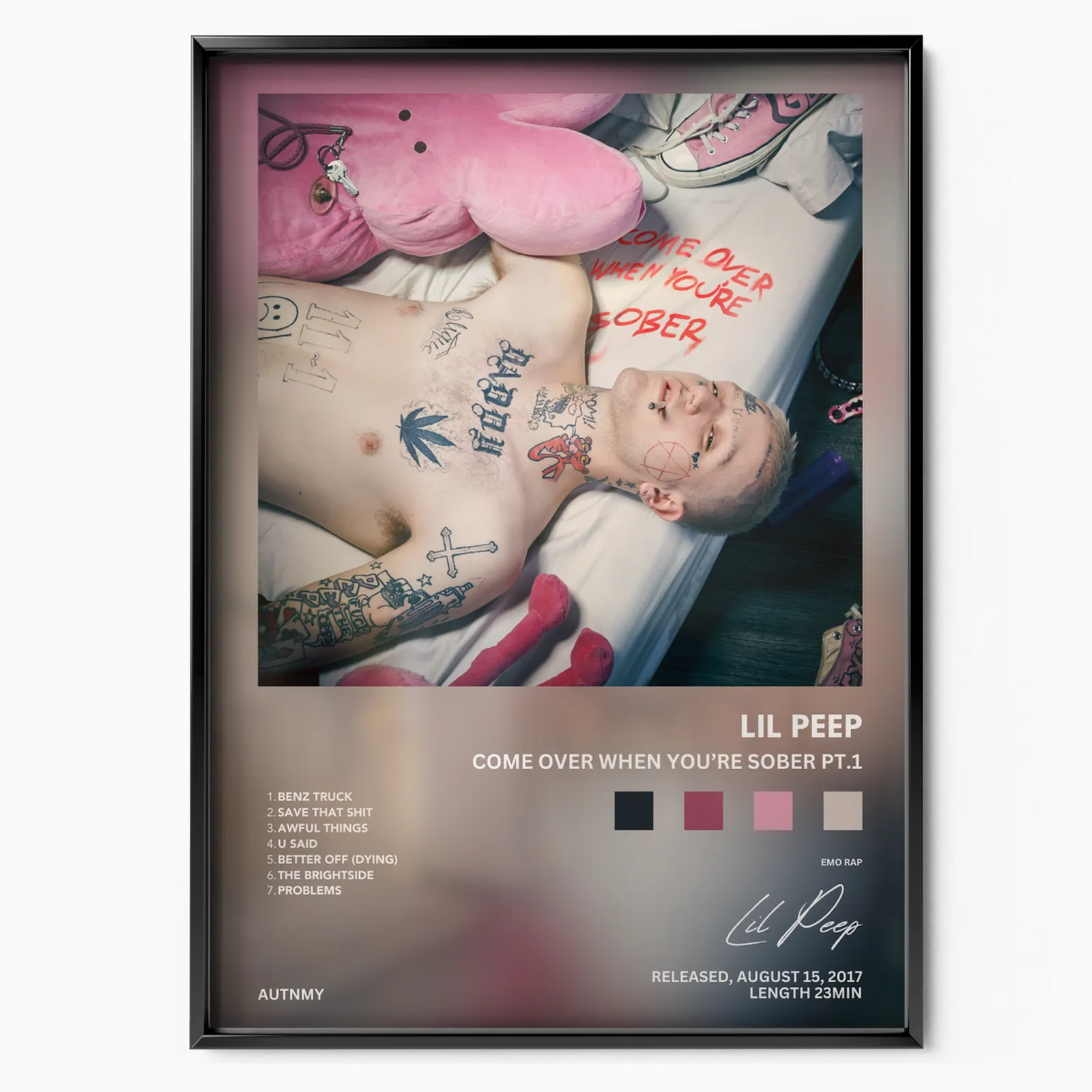
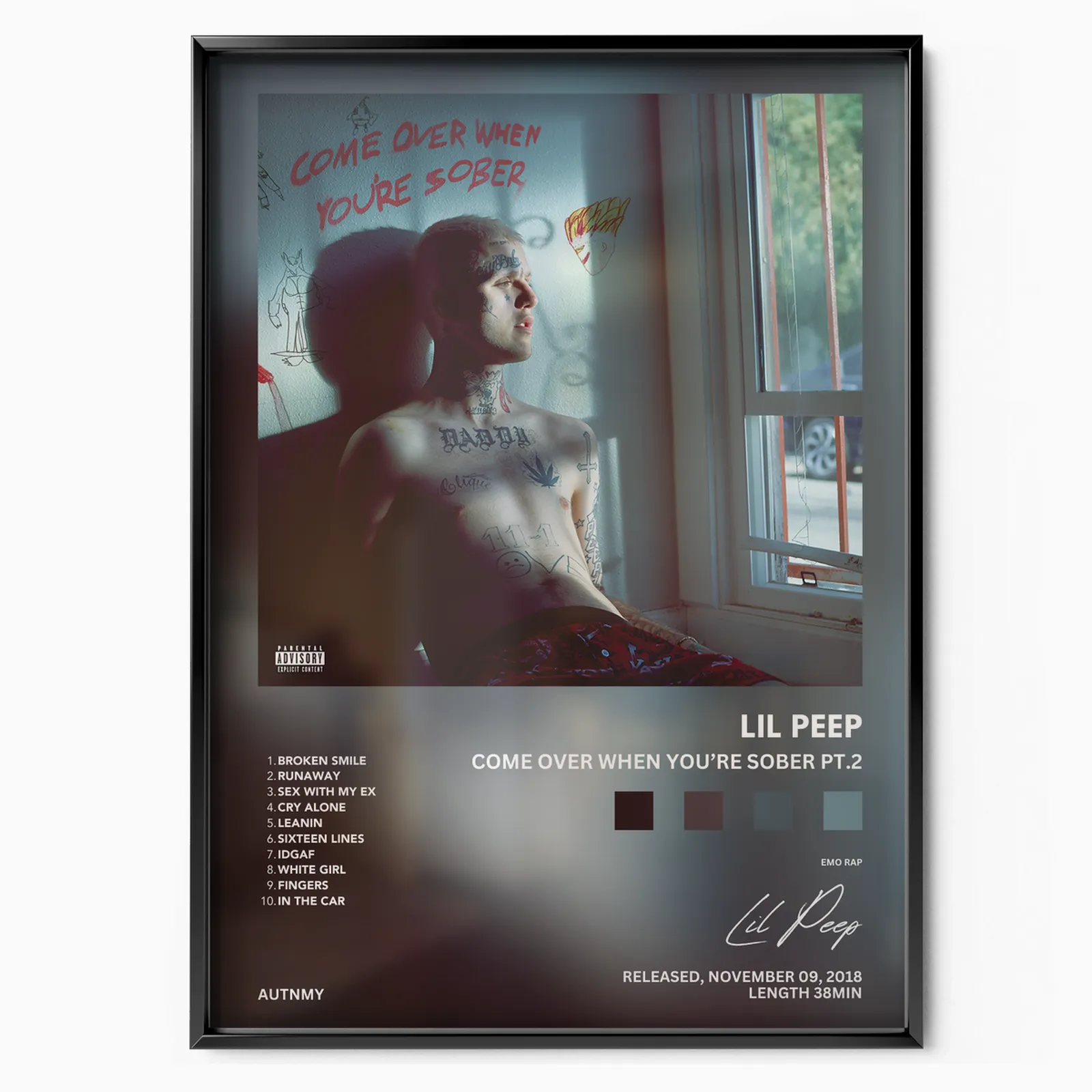

Lil Peep, born Gustav Elijah Ahr, helped define emo rap by fusing the raw feeling of emo and pop-punk with the cadence and production of hip-hop. His music paired confessional lyrics about heartbreak, anxiety, and addiction with guitar samples pulled from an earlier generation of emo bands. The posters in this collection trace a short but influential run of releases, from his major-label arrival to the records completed and shared after his death in November 2017 at age 21.
The sound that started emo rap
Before streaming playlists gave the style a name, Lil Peep was uploading tracks to SoundCloud and stacking loosely organized mixtapes. That groundwork set up his studio debut, Come Over When You're Sober, Pt. 1, a record that carried tattooed, pink-haired melancholy into the mainstream conversation.
A catalog cut short
His story turned tragic fast. Come Over When You're Sober, Pt. 2 arrived in 2018, completed and released after his passing, and the documentary companion album Everybody's Everything followed in 2019. Hung together, these covers read as a compact timeline of an artist who influenced far more music than he lived to make.
Why the covers work as wall art
Each sleeve leans on strong portraiture and moody color, so the artwork holds up at poster scale without busy detail getting lost. The imagery is bold and graphic, which is exactly what reads well from across a room.
Sizes and framing
Every poster is printed to order in standard frame-friendly ratios, so you can pick a size that fits the wall rather than forcing the wall to fit the print. Smaller sizes suit a desk, a shelf ledge, or a tight cluster; larger sizes work as a single anchor piece. A simple black or natural wood frame keeps the focus on the artwork, and a white mat adds breathing room around darker covers so they do not disappear into a dim room.
Building a gallery wall
Because these three covers share a tone, they group cleanly. Line them up in release order for a left to right timeline, or stagger them among other emo rap and hip-hop covers for a mixed grid. Keep frame color and spacing consistent, roughly two to three inches between frames, and the set will read as one considered display rather than a random pile of prints.