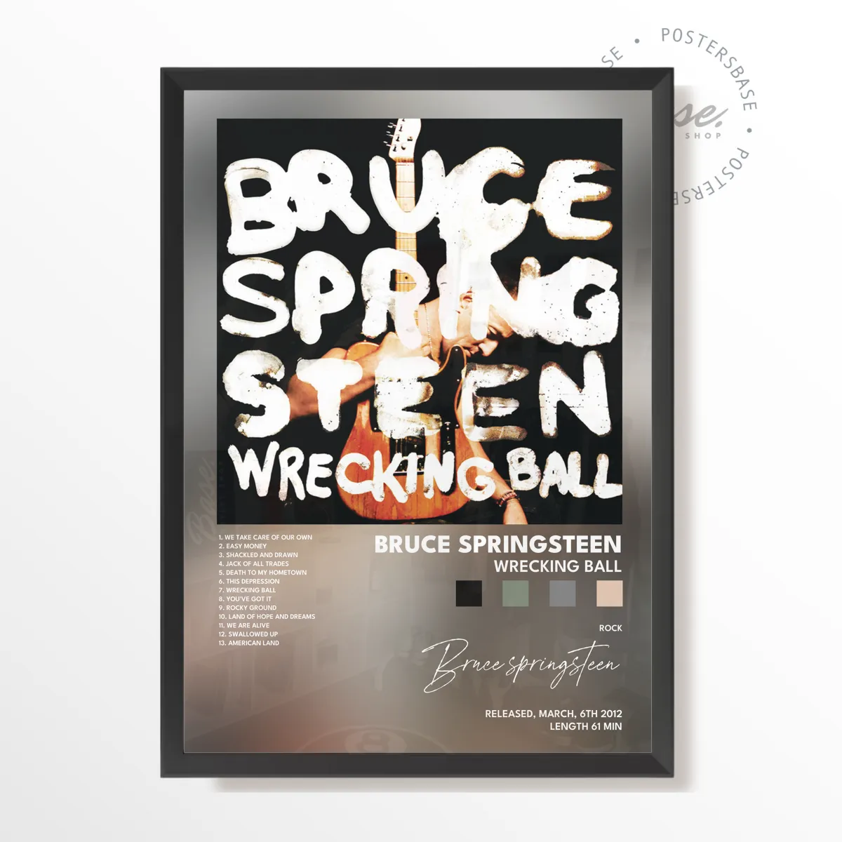
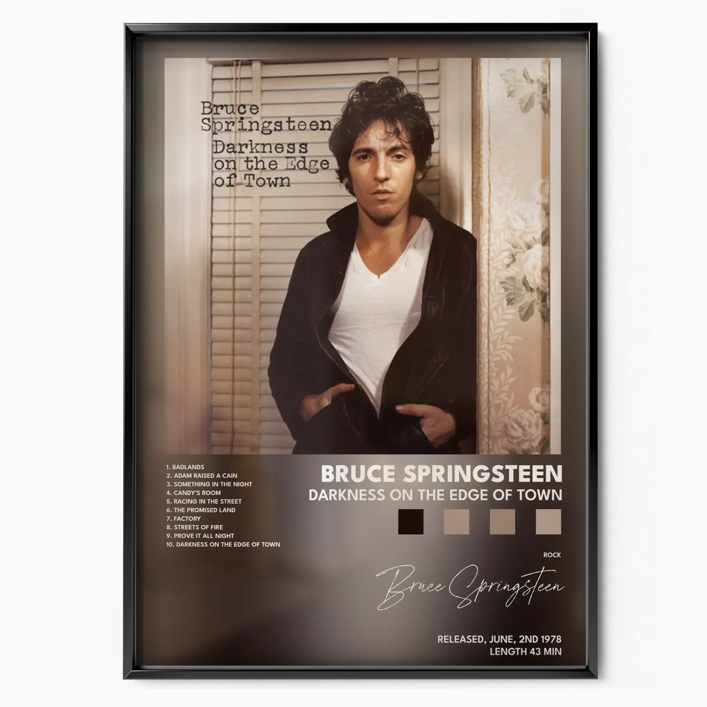
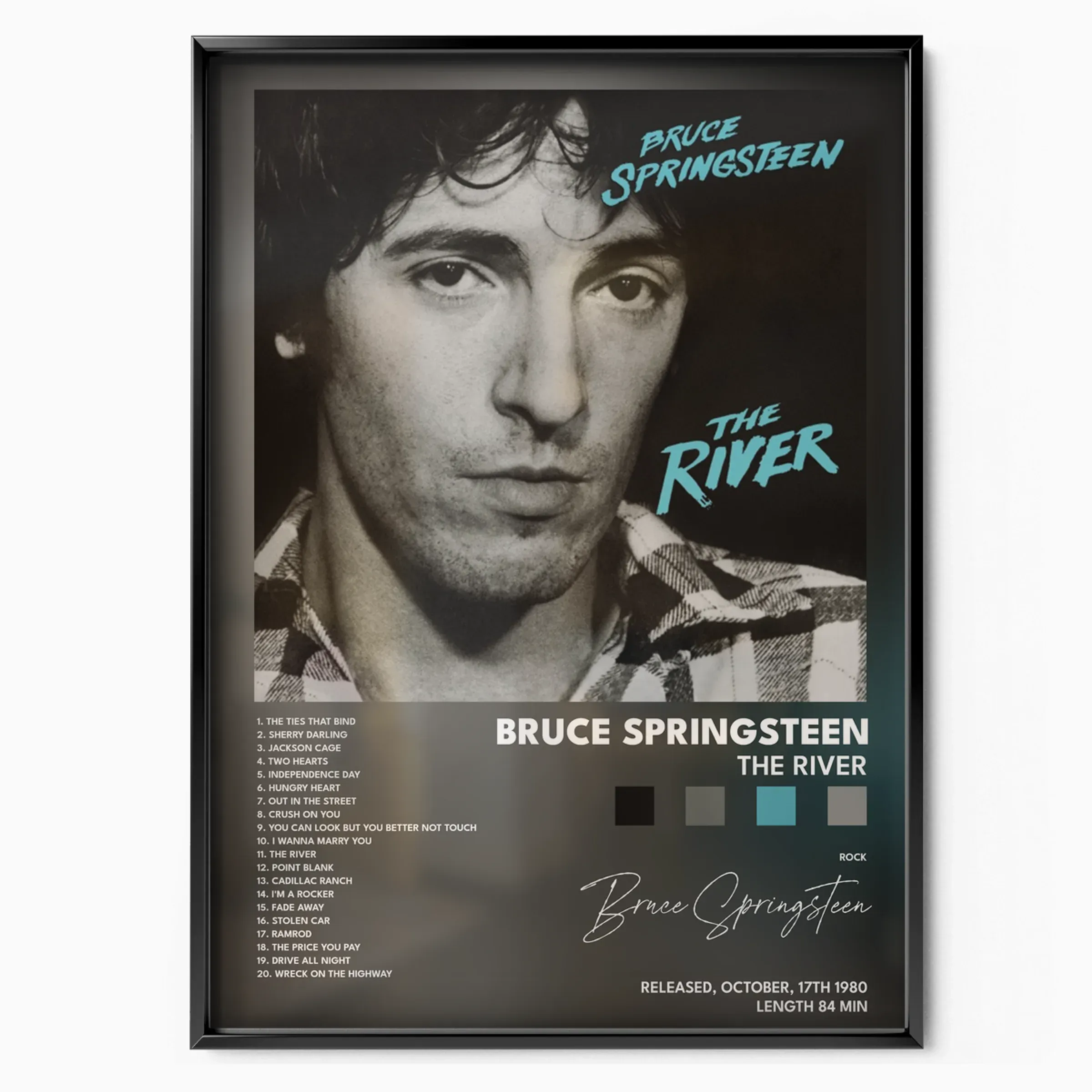
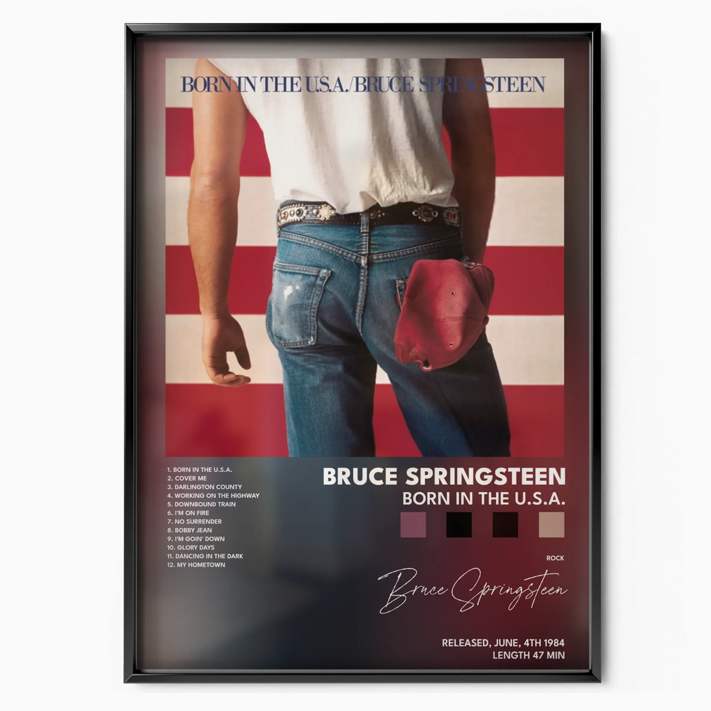
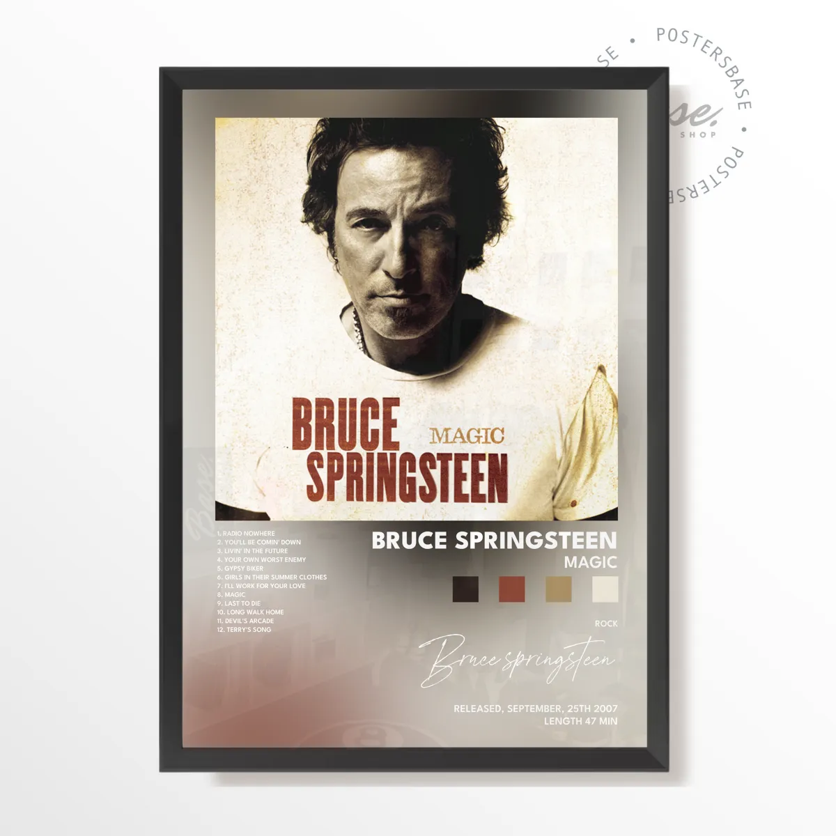
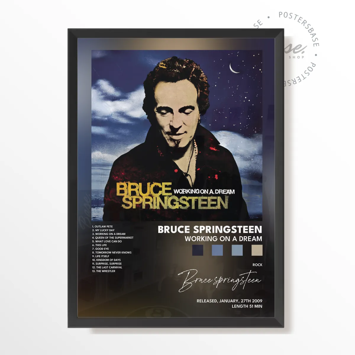
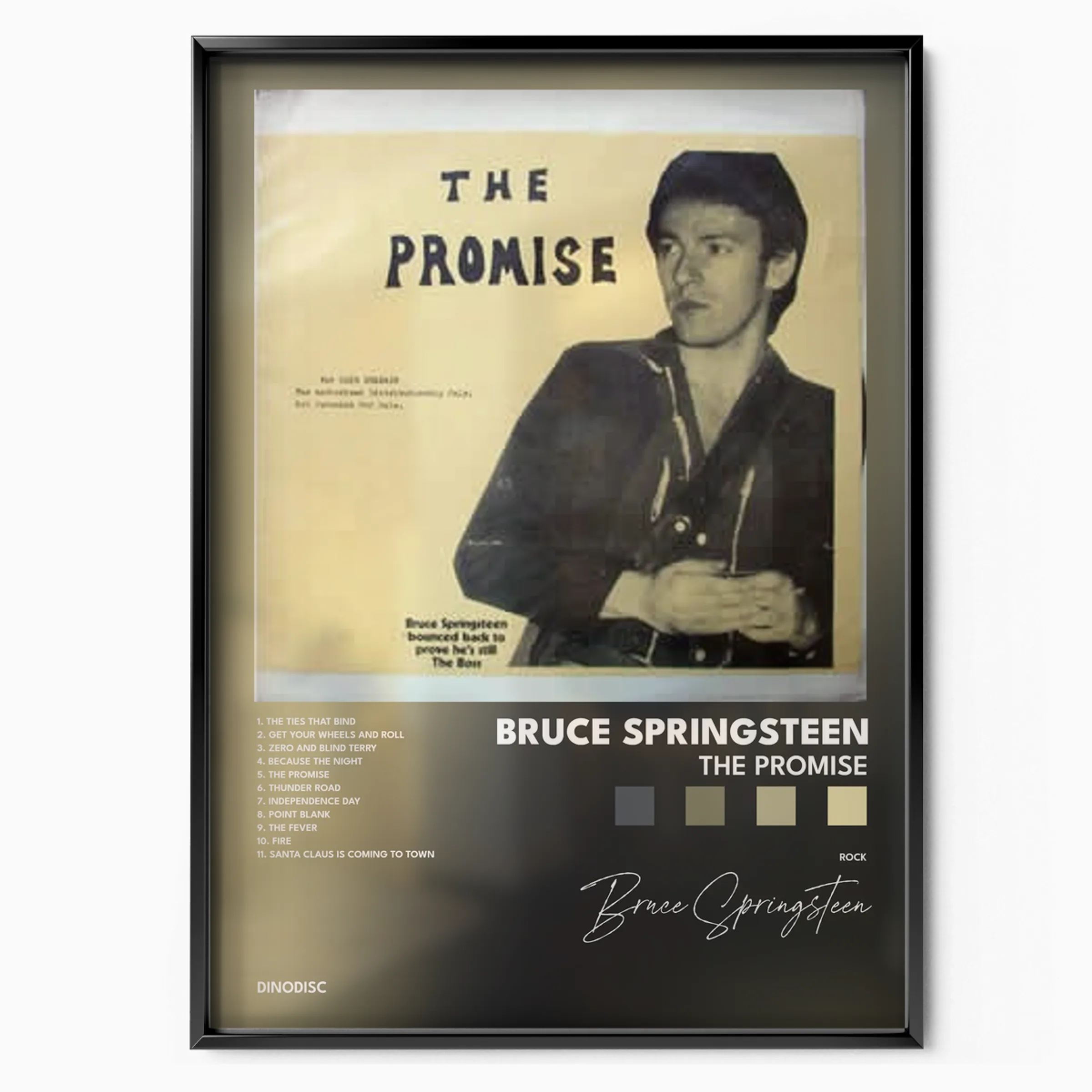
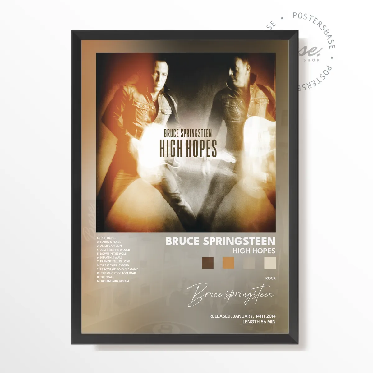
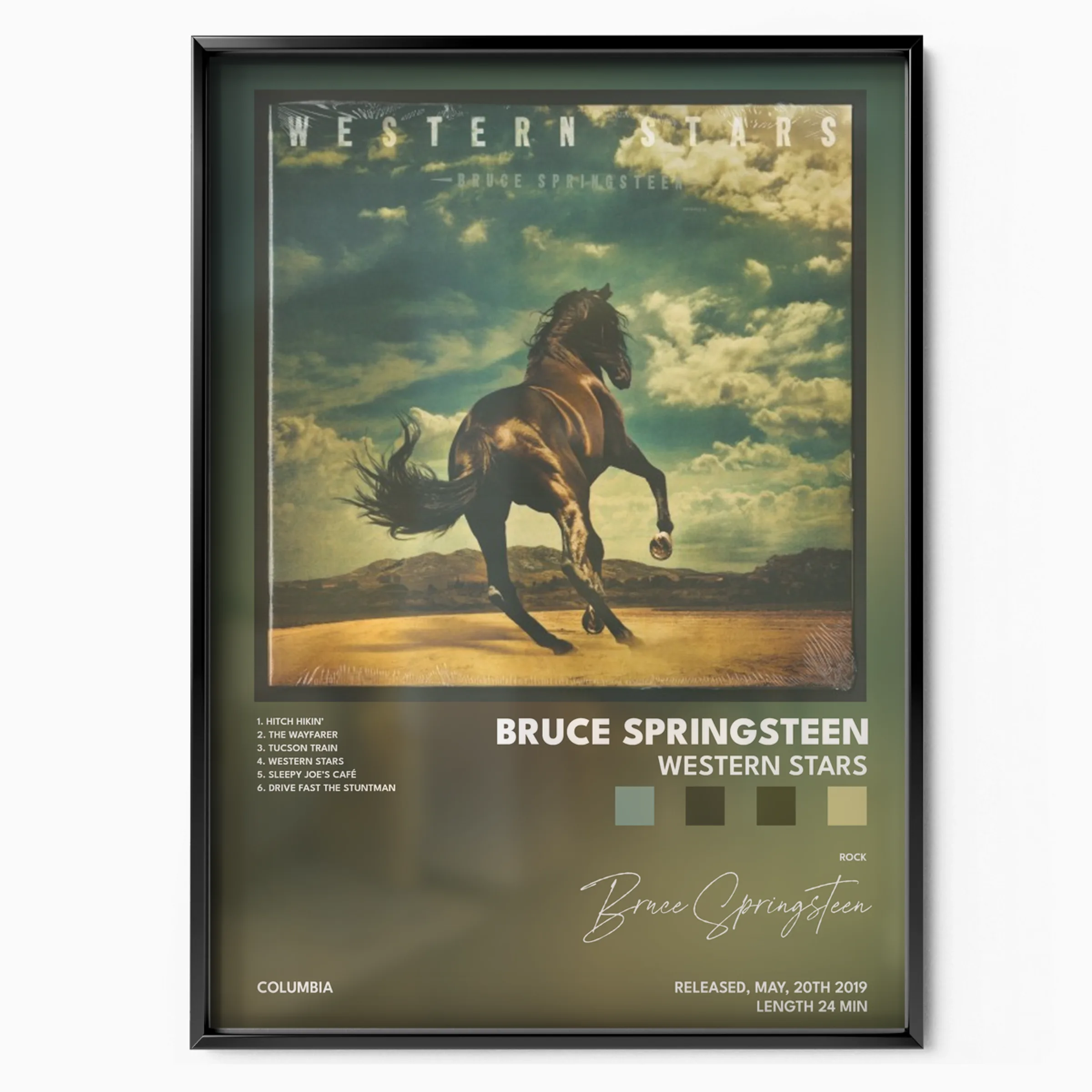
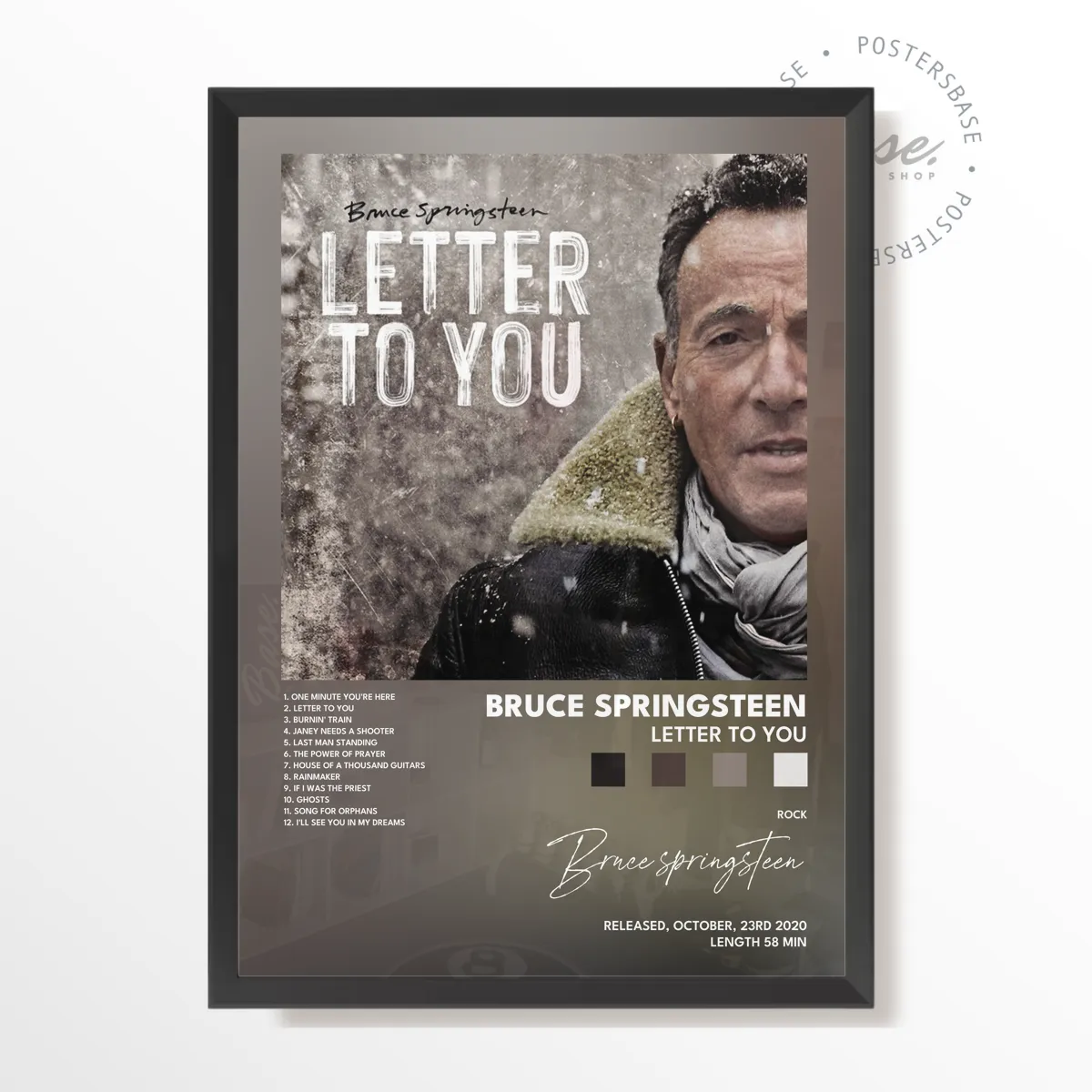
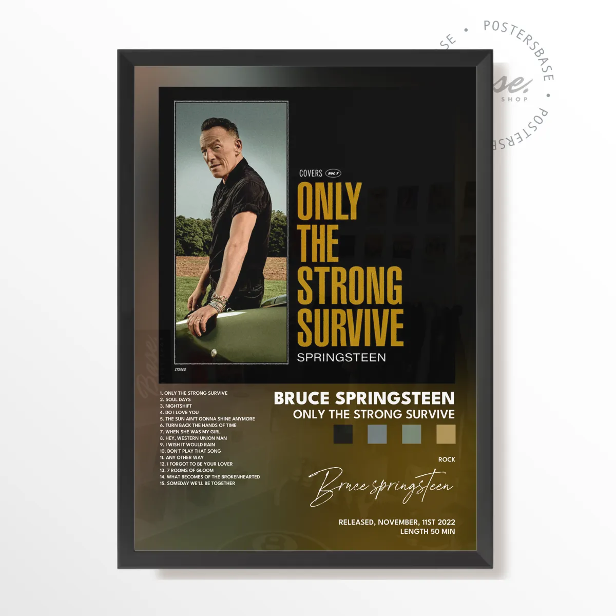
Bruce Springsteen posters are independent, museum grade art prints, not official or licensed merchandise. The Boss's greatest album covers, from Born to Run to Born in the U.S.A., reborn as museum-grade wall art. Each print is produced on 200 gsm matte paper with archival inks, offered A4 to A1, framed or unframed.
- Full name
- Bruce Frederick Joseph Springsteen
- Born
- September 23, 1949, Long Branch, New Jersey
- Nickname
- The Boss
- Backing band
- The E Street Band
- Breakthrough album
- Born to Run (1975)
- Best seller
- Born in the USA (1984), over 30 million copies
- Paper
- Museum-grade 200gsm matte
- Sizes
- A4 to A1
- Frames
- Black, chrome, white, or unframed
- Offer
- Buy 2 Get 1 Free
Bruce Springsteen turned the American highway, the factory town, and the Jersey Shore into a body of work, and the album covers carried that story in a single frame. That is why his sleeves make such natural wall art: they are documentary photographs first, built from denim, chrome, grain, and open road rather than studio gloss. Blown up to poster scale, they hold a room. From the 1975 breakthrough to the late-career records, the visual language stays honest, and that consistency is a gift to anyone hanging more than one print.
01Why The Boss Belongs on Your Wall
Few rock catalogs translate to wall art as cleanly as Springsteen's. Take the Born to Run sleeve from 1975: photographer Eric Meola shot nearly 700 frames in a two-hour session, and the keeper shows a grinning Springsteen leaning on saxophonist Clarence Clemons, the Big Man of the E Street Band. The shot was never posed to sell records; it caught two friends messing around, and that unforced honesty is exactly what makes it hold up at any size. Printed large, that gatefold image becomes a study in friendship and swagger.
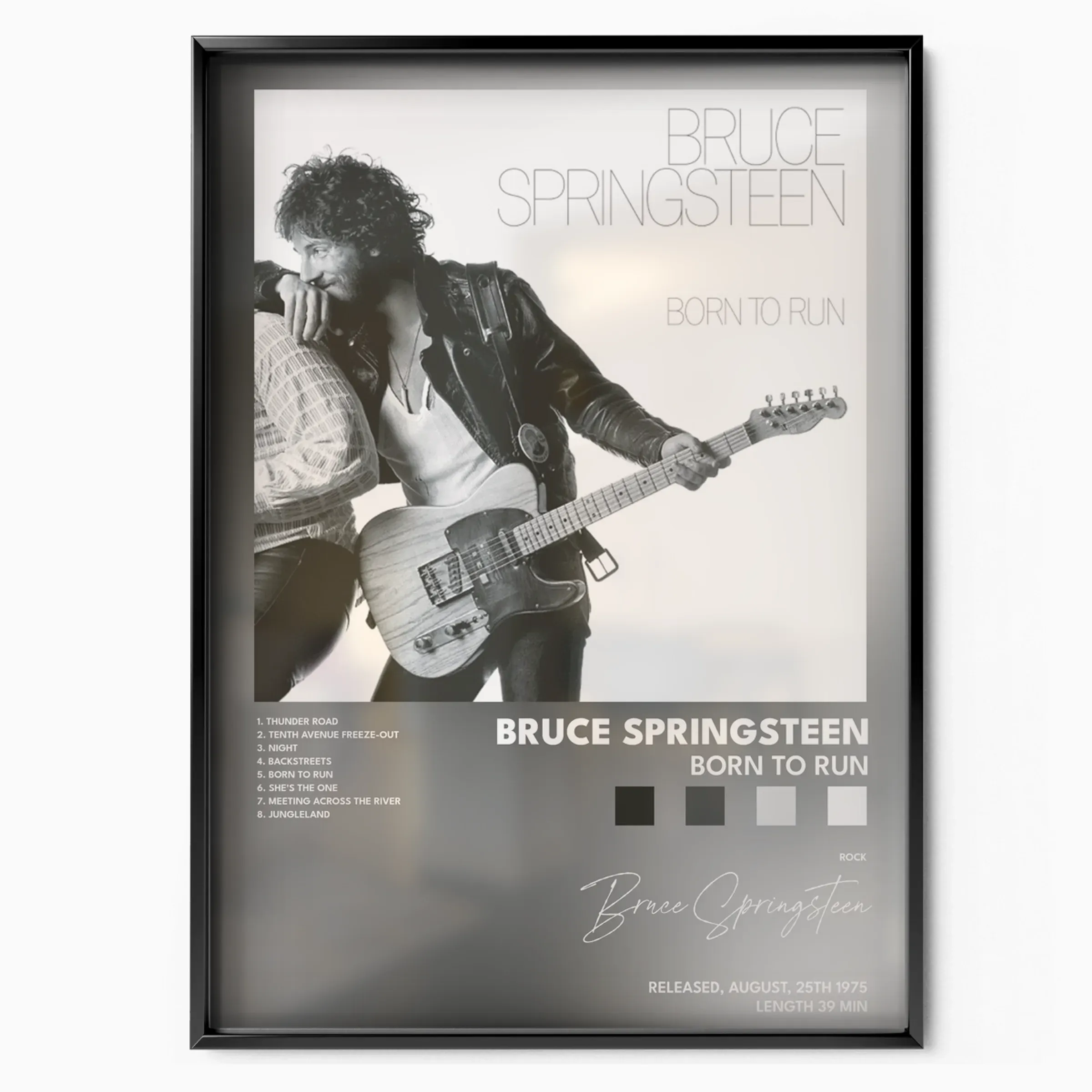
02Covers That Earn Their Frame
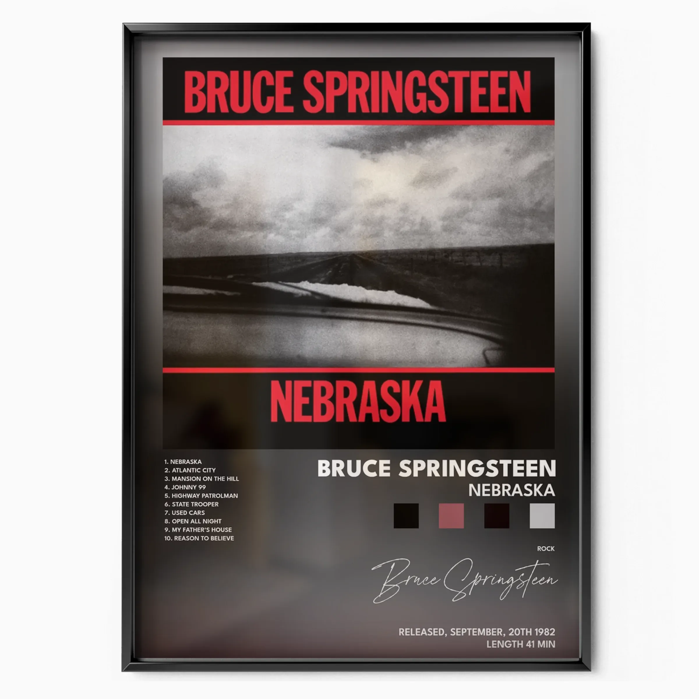
The 1984 Born in the U.S.A. cover is the most recognizable image in the catalog: Annie Leibovitz photographed Springsteen from behind, a red cap tucked into the back pocket of his jeans, set against broad red and white stripes. It is endlessly misread as a flag-waving anthem when the record beneath it is anything but, and that tension makes it a compelling print. For a quieter mood, the Nebraska sleeve is pure austerity: a stark black and white view of a flat winter road seen through a car windshield, matched to the home-recorded songs behind it. The Darkness on the Edge of Town portrait, shot by Frank Stefanko against floral bedroom wallpaper, brings the same lived-in grit.
03Choosing Your Size and Frame
Every poster is made to order and offered from compact A4 up to statement A1. A4 and A3 suit a desk, a hallway, or a tight gallery cluster; A2 and A1 command a living room or studio wall on their own. Three finishes cover most rooms: unframed for the collector who already owns frames, a black frame for the high contrast that suits the moody Nebraska and Darkness images, and a white-chrome frame that lets the bold color of Born in the U.S.A. or The River breathe. Sizing is easy to plan: measure your wall, then leave room for the eye to rest around the frame so the image reads as art, not wallpaper. Whatever you pick, the print stays the star.
04Gallery-Wall Ideas
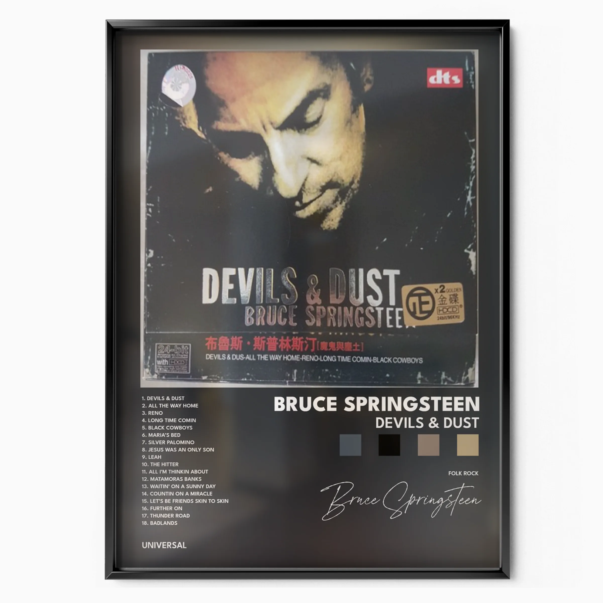
A single A1 works as an anchor above a sofa or a turntable. For a fan wall, group three A3 prints in matching frames and hang them chronologically, letting the palette shift from the warm gold of the seventies to the flag-bright eighties and the muted tones of later records like Letter to You. Mixing an iconic sleeve with a deeper cut keeps the arrangement personal rather than predictable. You can also lean a single large print on a shelf or mantel for a looser, record-store feel. Because each piece is printed on the same museum matte stock, a multi-frame grid stays consistent even when the eras clash. Hang everything at eye level, leave a steady gap of a few centimeters between frames, and let the music do the rest.