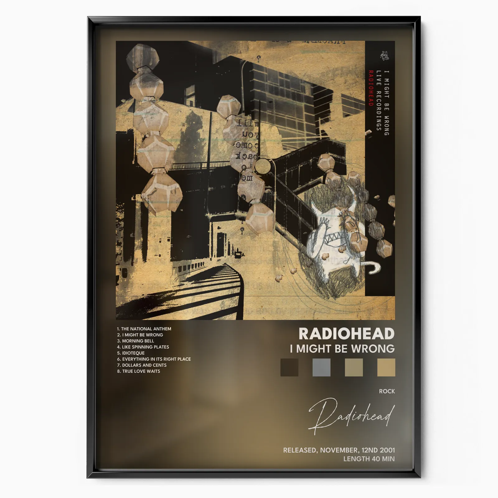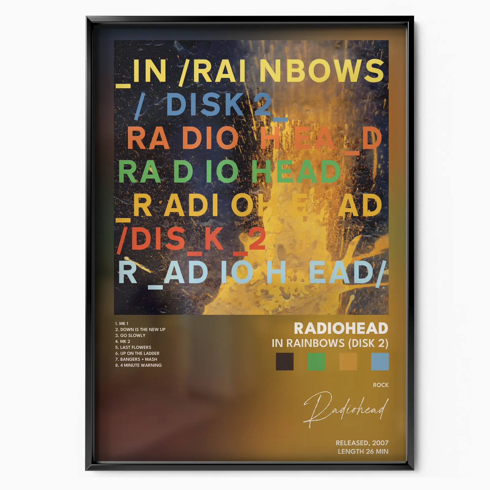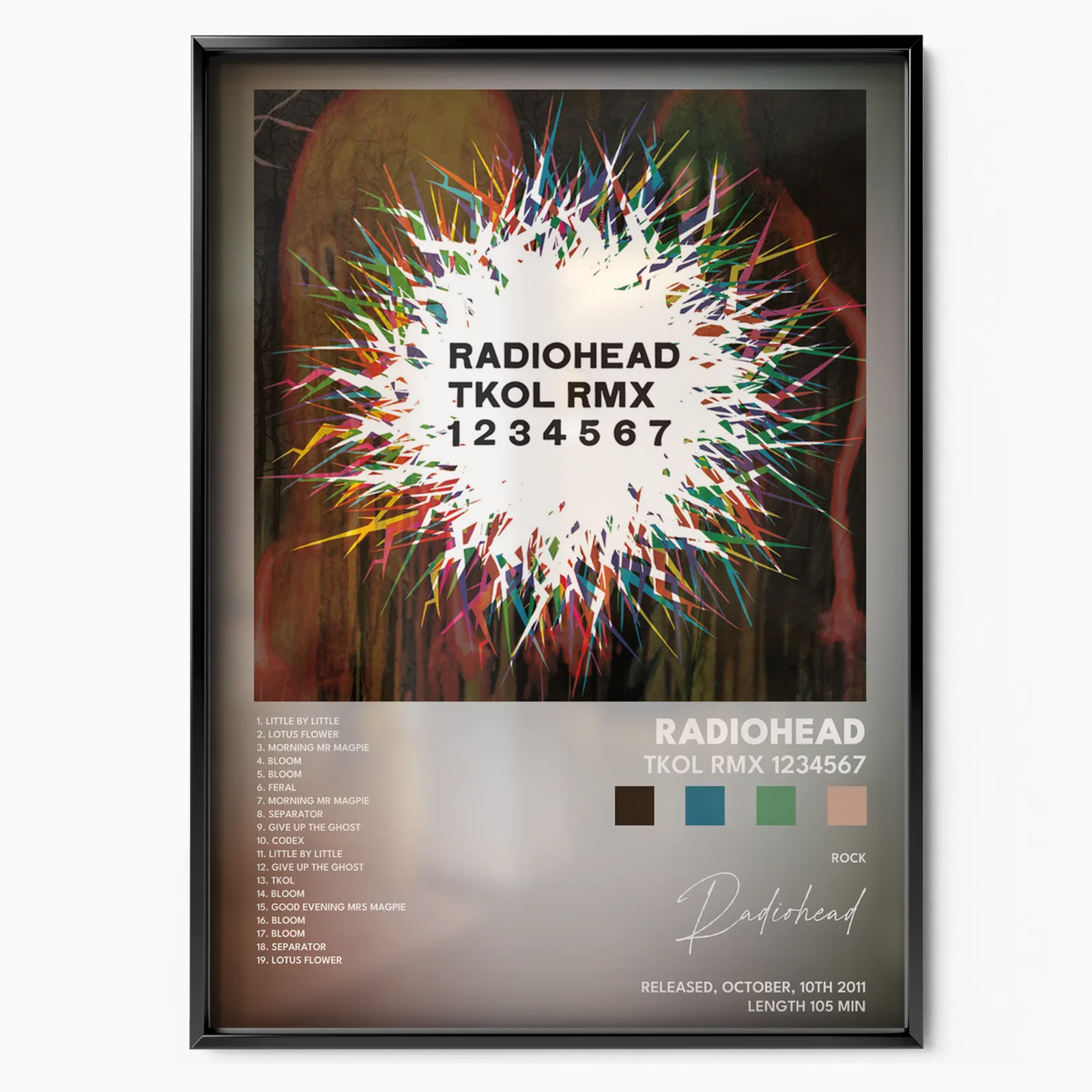
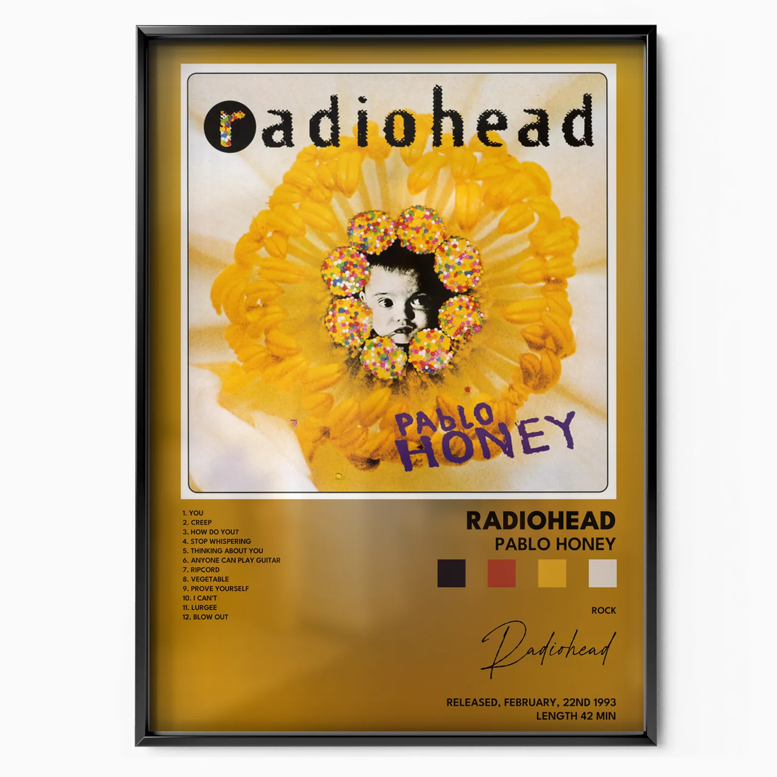
Few bands turned their record sleeves into a body of work the way Radiohead did. Since 1994 the artist Stanley Donwood has painted, burned, scanned and weathered almost every cover, building a visual language that runs alongside the music. On a wall, these covers read less like merch and more like a gallery of modern anxiety and beauty. Here is the story, album by album.
The Guitar Era (1993 to 1997)
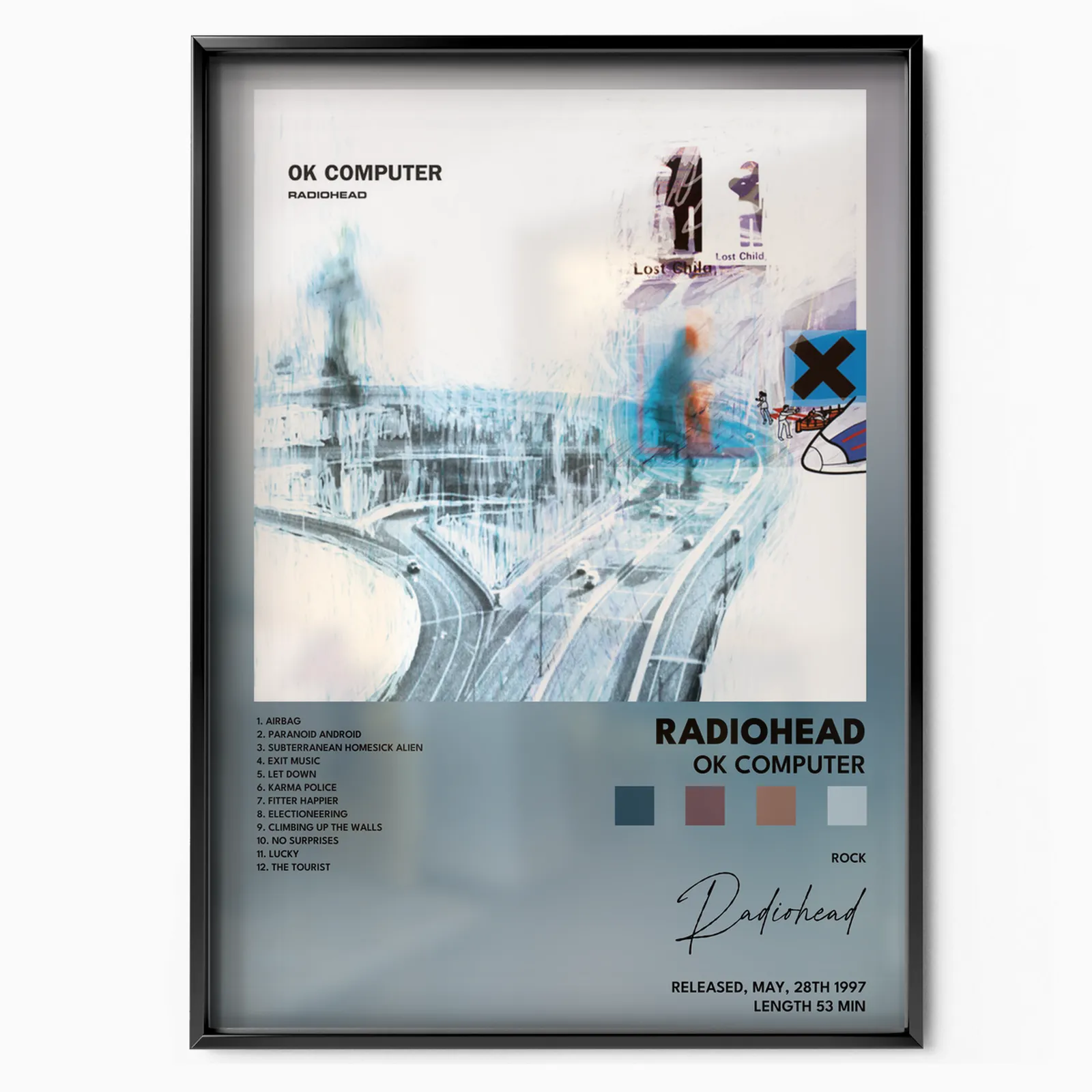
Everything starts with Pablo Honey, the 1993 debut released on Parlophone. Its cover is pure early nineties: a baby's face ringed with candy and flower petals, cheerful and strange. It carried Creep and little hint of what came next. Four years later the band returned transformed with OK Computer. Donwood built the sleeve on a computer with a tablet pen and one rule, that nothing could be erased. The result is a bleached bone highway interchange dissolving into white fog, based on the I-84 and I-91 junction near Hartford, Connecticut. It became a landmark of alienation and consumer dread, and in 2015 the Library of Congress added the album to its National Recording Registry.
The Electronic Reinvention (2000 to 2001)
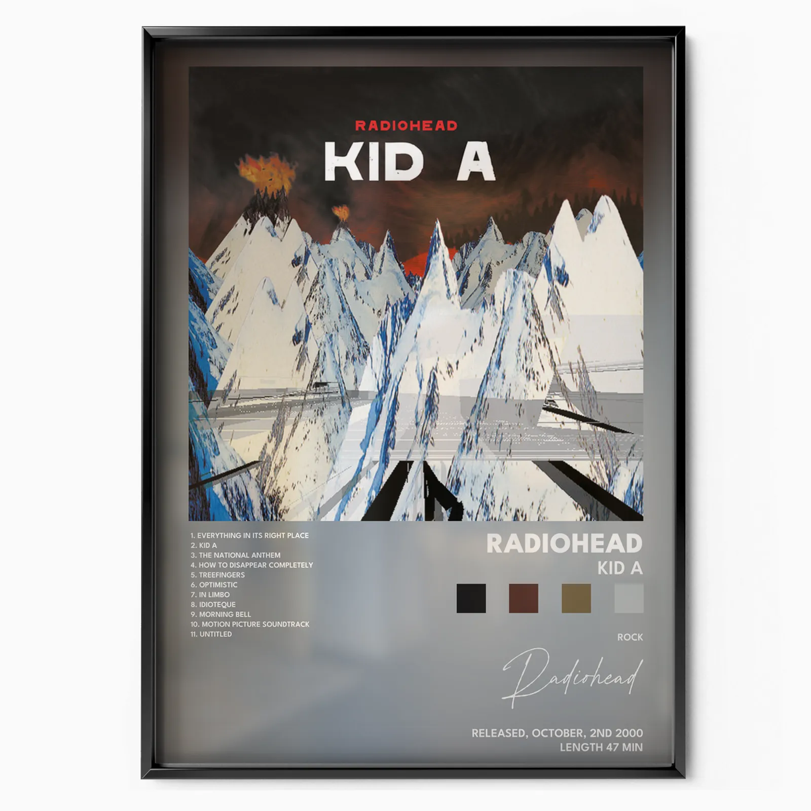
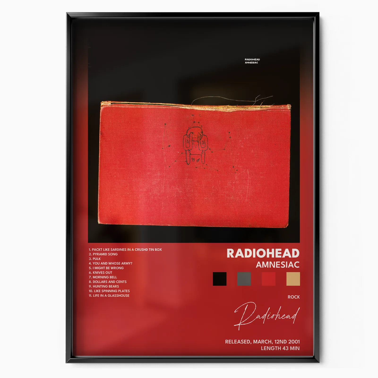
With Kid A the band walked away from guitars, and Donwood walked away from the computer. He moved into the studio and attacked huge canvases with knives and sticks, then photographed and manipulated the results. The cover's jagged mountains, fire and ice were painted out of a fear of climate change and melting ice caps, landscapes of cataclysmic power. In 2000 it became the first Radiohead album to top the US Billboard 200. Its sister record, Amnesiac, drawn from the same sessions, gives you a weeping Minotaur on a tattered red library book. Donwood described feeling lost in London like a creature in a labyrinth, and some of the source art was literally set on fire and scanned.
Politics and Warmth (2003 to 2007)
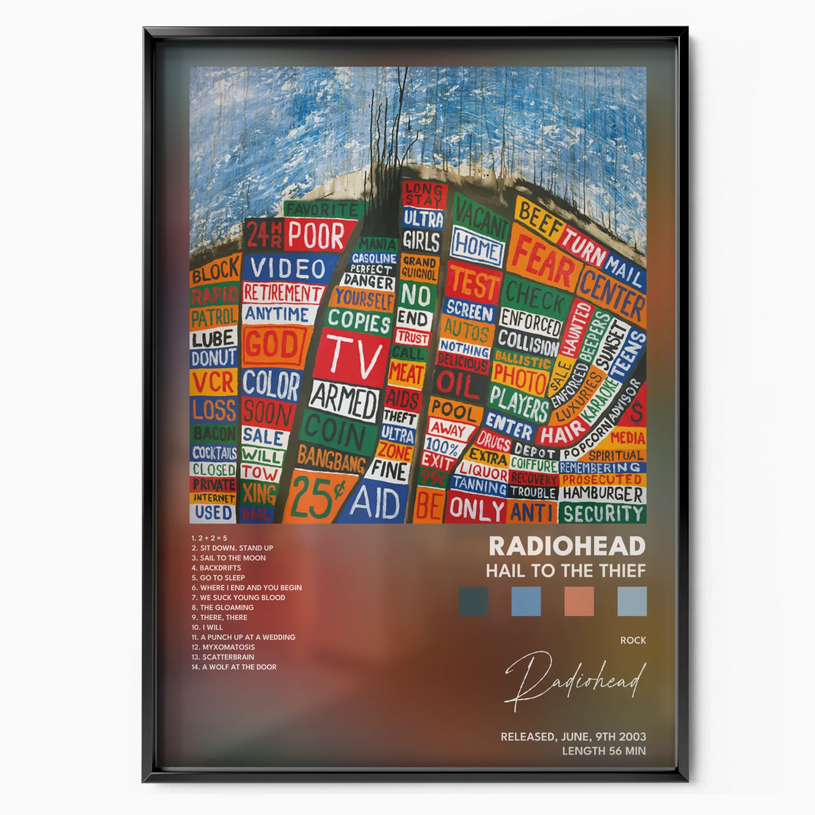
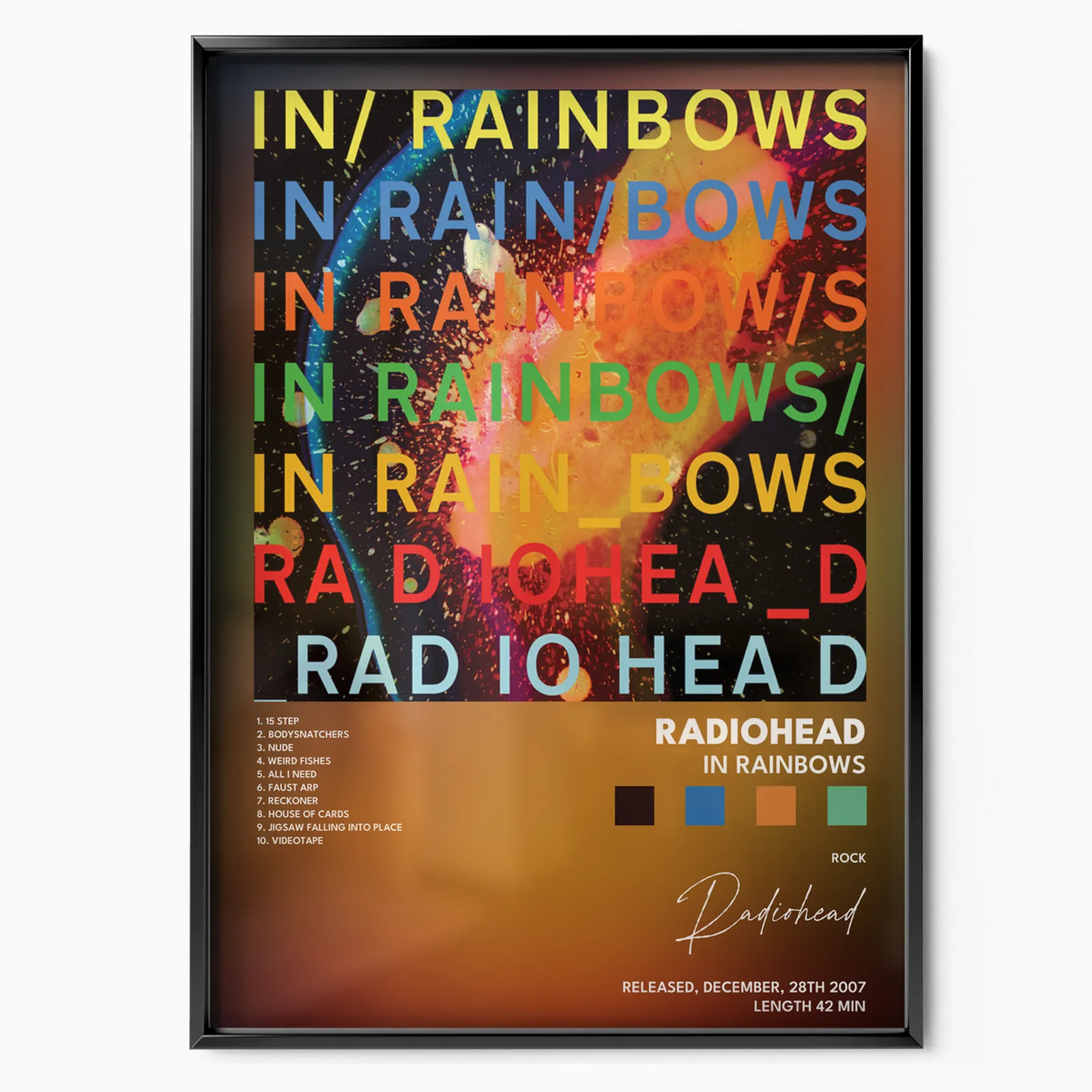
Hail to the Thief is a map made of words. Donwood, who cannot drive, sat as a passenger through Los Angeles copying down roadside signs, phrases like OIL, LUBE and RETIREMENT, then cut them into colored squares laid over city grids. It is a protest record you can hang. Then came In Rainbows in 2007, famous for its pay what you want download, but its physical sleeve is just as memorable: an explosion of layered color, letters stacked in seven rainbow lines against black. It won the Grammy for Best Alternative Music Album. The extra Disk 2 material extended that warm, spilled ink palette even further.
The Textural Late Period (2011 to 2016)
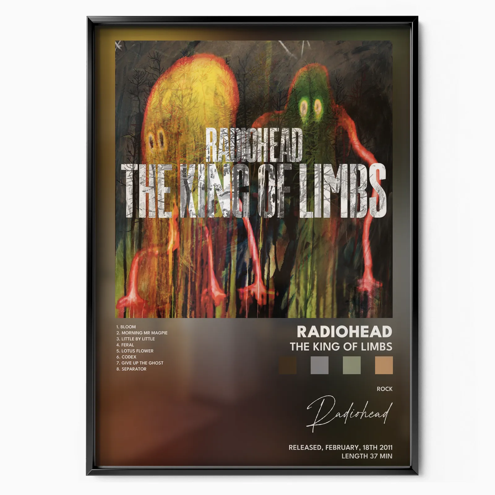
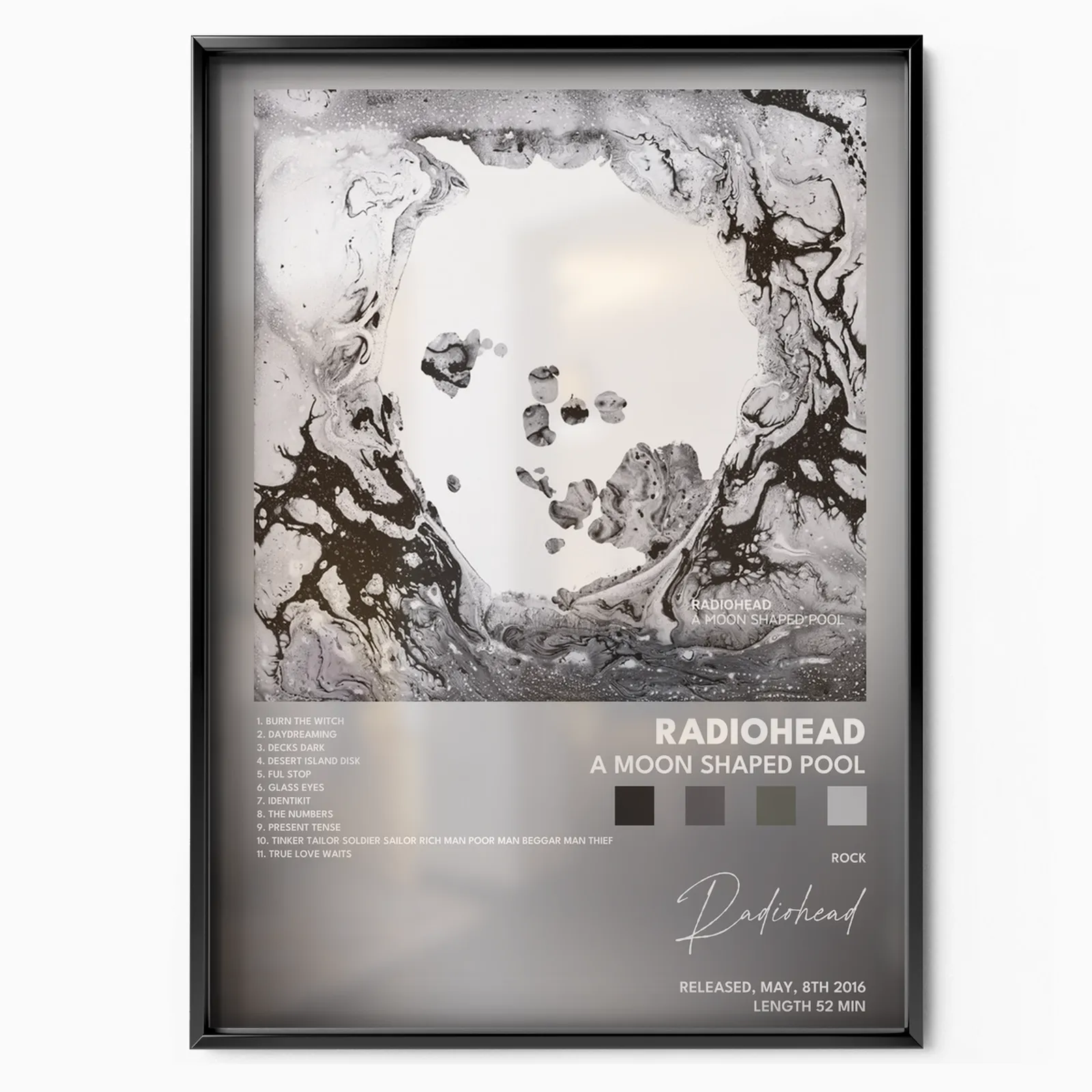
The King of Limbs takes its name from a thousand year old oak in Wiltshire's Savernake Forest, and its artwork is all wildness and mutation, spectral creatures growing out of the frame. Finally, A Moon Shaped Pool closes the story with pure abstraction. Donwood worked in a barn beside the studio, speakers wired in so he could hear the recording, and left his acrylic paintings out in the weather so the elements could finish them.
On buying: every poster prints on museum grade paper in sizes from compact A4 up to statement A1. A4 and A3 suit a desk, a shelf or a tight cluster. A2 and A1 command a room on their own. Unframed prints ship rolled and let you pick your own frame, while our framed option arrives ready to hang. If you want fidelity to Donwood's exact tones, the framed print under glass holds those bleached whites and deep blacks best.
For a gallery wall, these covers were made to sit together. A clean approach is chronological: Pablo Honey through A Moon Shaped Pool in a grid, watching the palette shift from candy pink to bone white to volcanic red to spilled rainbow. Or pair opposites, the foggy grey of OK Computer against the burning color of In Rainbows, for instant tension. Keep to one size and even spacing for a considered look, or mix A3 and A2 for something loose and personal. Either way you are hanging one of the most coherent visual runs in modern music.