
Coldplay grew from a London university friendship into one of the most widely heard rock bands of their generation. Chris Martin, Jonny Buckland, Guy Berryman, and Will Champion built a catalogue that runs from hushed piano ballads to stadium anthems, and each album cover became a visual signature in its own right. This collection gathers those covers as museum grade prints, from the rain streaked calm of the debut to the saturated color of their later work.
From Parachutes to stadiums
The story starts with Parachutes in 2000, the album that carried Yellow and introduced Martin's falsetto to the world. Two years later A Rush of Blood to the Head sharpened the sound and delivered Clocks and The Scientist, songs that still anchor their live set. The leap to full color arrived with Viva la Vida or Death and All His Friends in 2008, an album that topped charts worldwide and whose title track won a Grammy.
A cover built on a painting
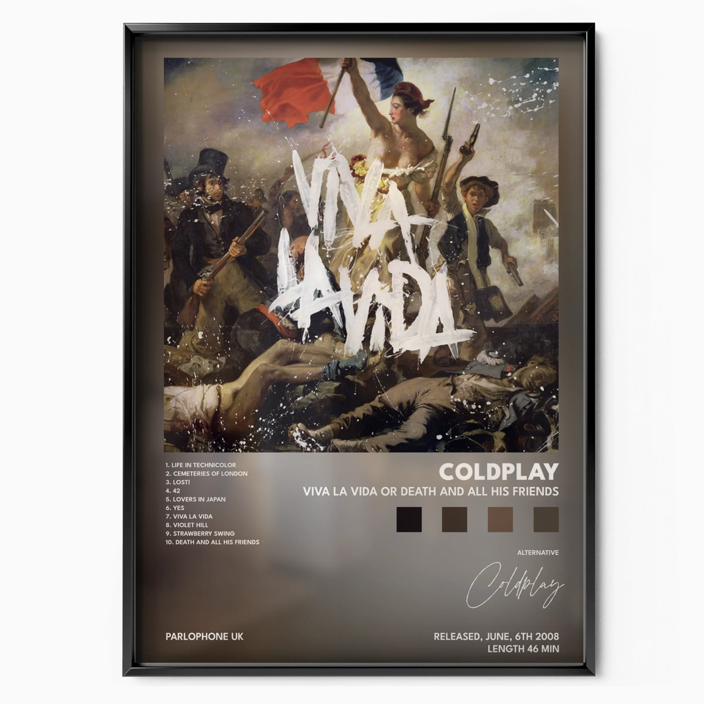
The Viva la Vida sleeve is one of the most recognizable in modern rock. It reproduces Eugene Delacroix's Liberty Leading the People, the 1830 painting, with the album title scrawled across it in white. Hung as a print, it reads as much as an art poster as a music one, which makes it a favorite for people who want a cover that carries a story beyond the band.
Color and light
By 2015 the band leaned fully into brightness with A Head Full of Dreams, whose cover borrows the geometry of a color wheel and the Flower of Life pattern. Placed next to the muted debut, it shows how far the visual language traveled across fifteen years.
Sizes and framing
Every poster in this collection is offered in a range of standard sizes so it fits a slim frame above a desk or a large statement frame over a sofa. The prints suit simple black or natural wood frames, and a white mat lifts the darker covers like Parachutes and A Rush of Blood to the Head off the wall. Leave a consistent border and the whole set reads as one series.
Building a gallery wall
These four covers were made to hang together. Run them in release order for a timeline, or group the two darker early sleeves against the two bright later ones for contrast. Keep frame color and spacing consistent, around five to seven centimeters between frames, and the wall stays calm even when the artwork is loud.