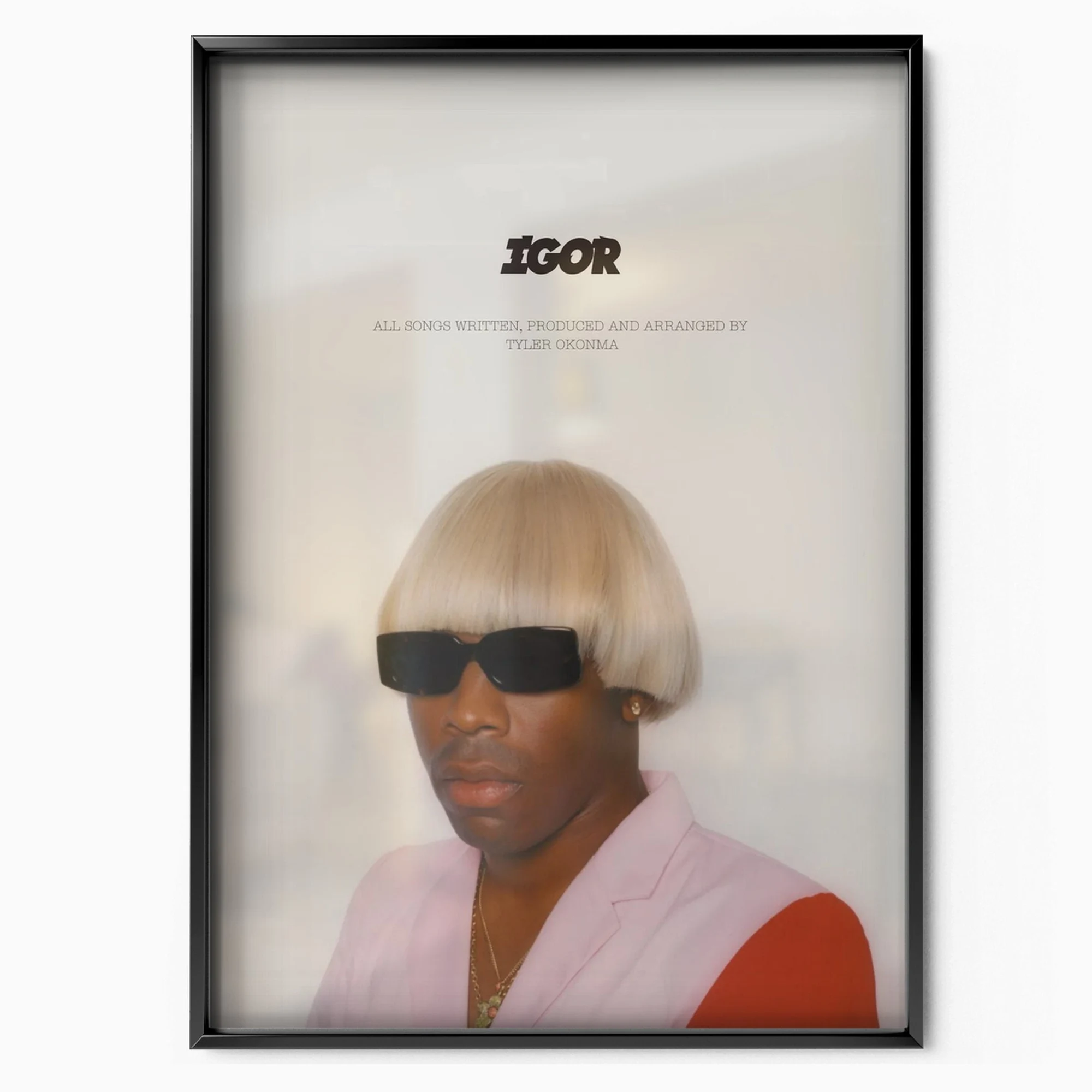
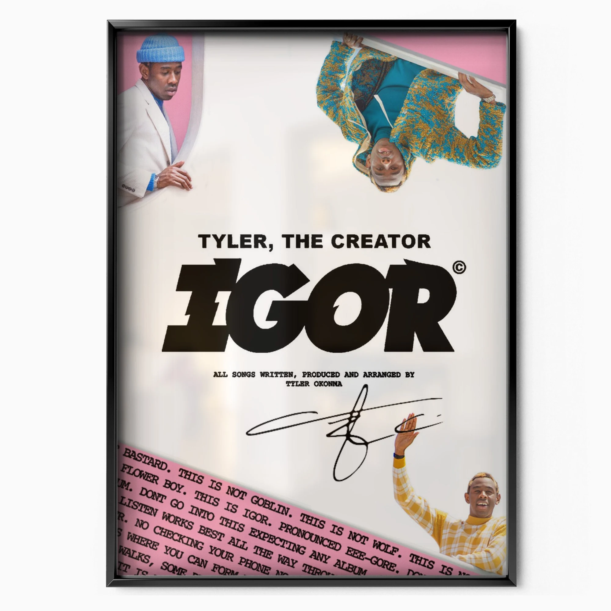
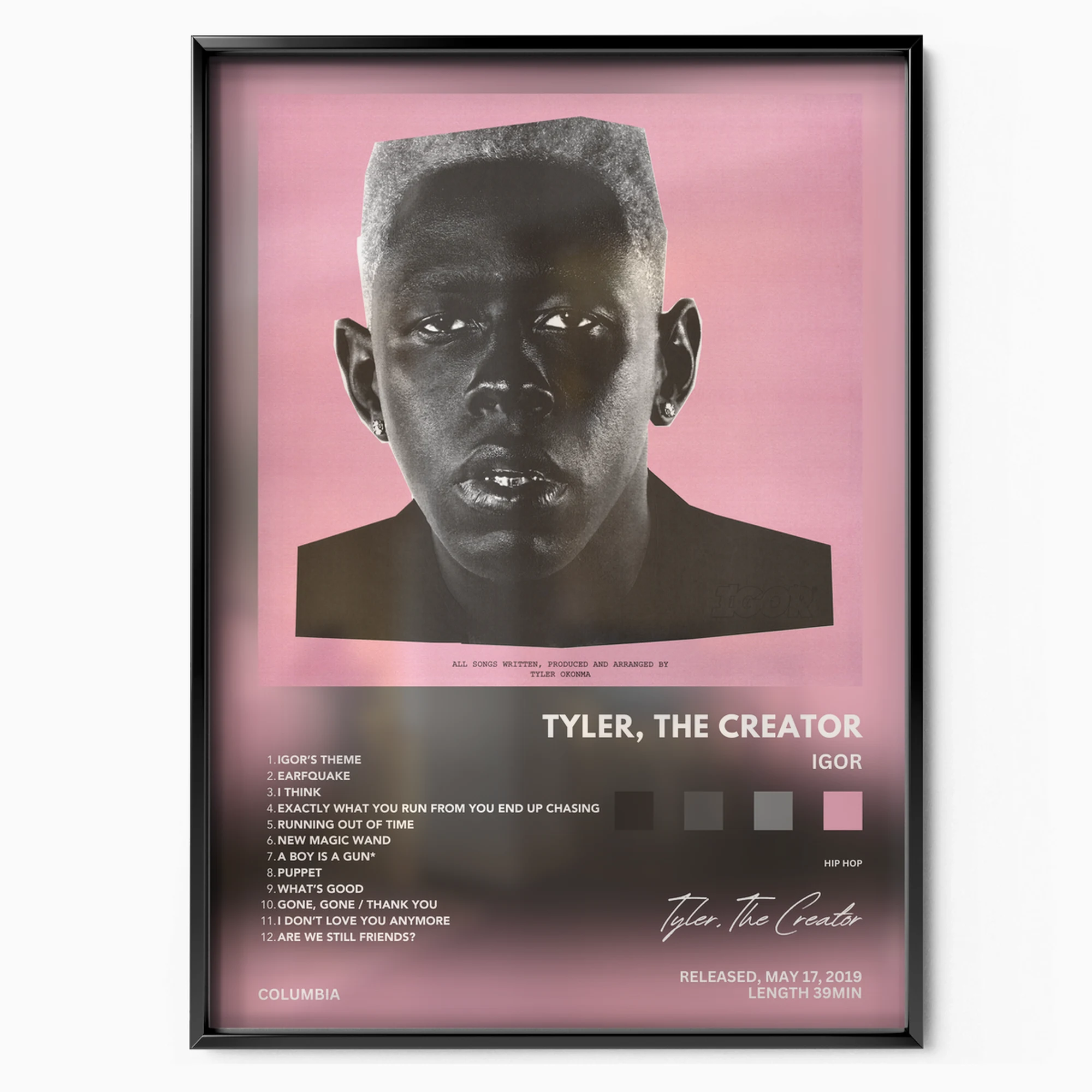
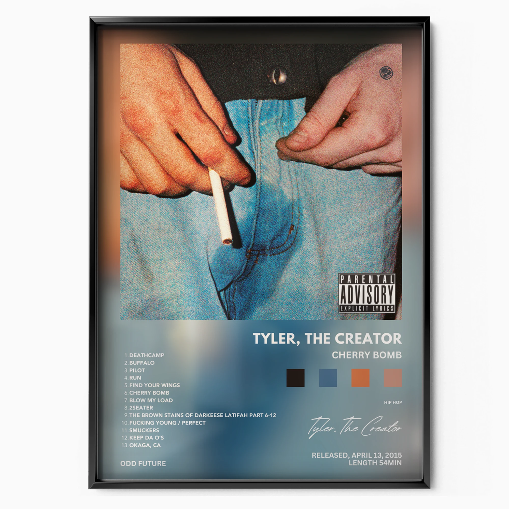
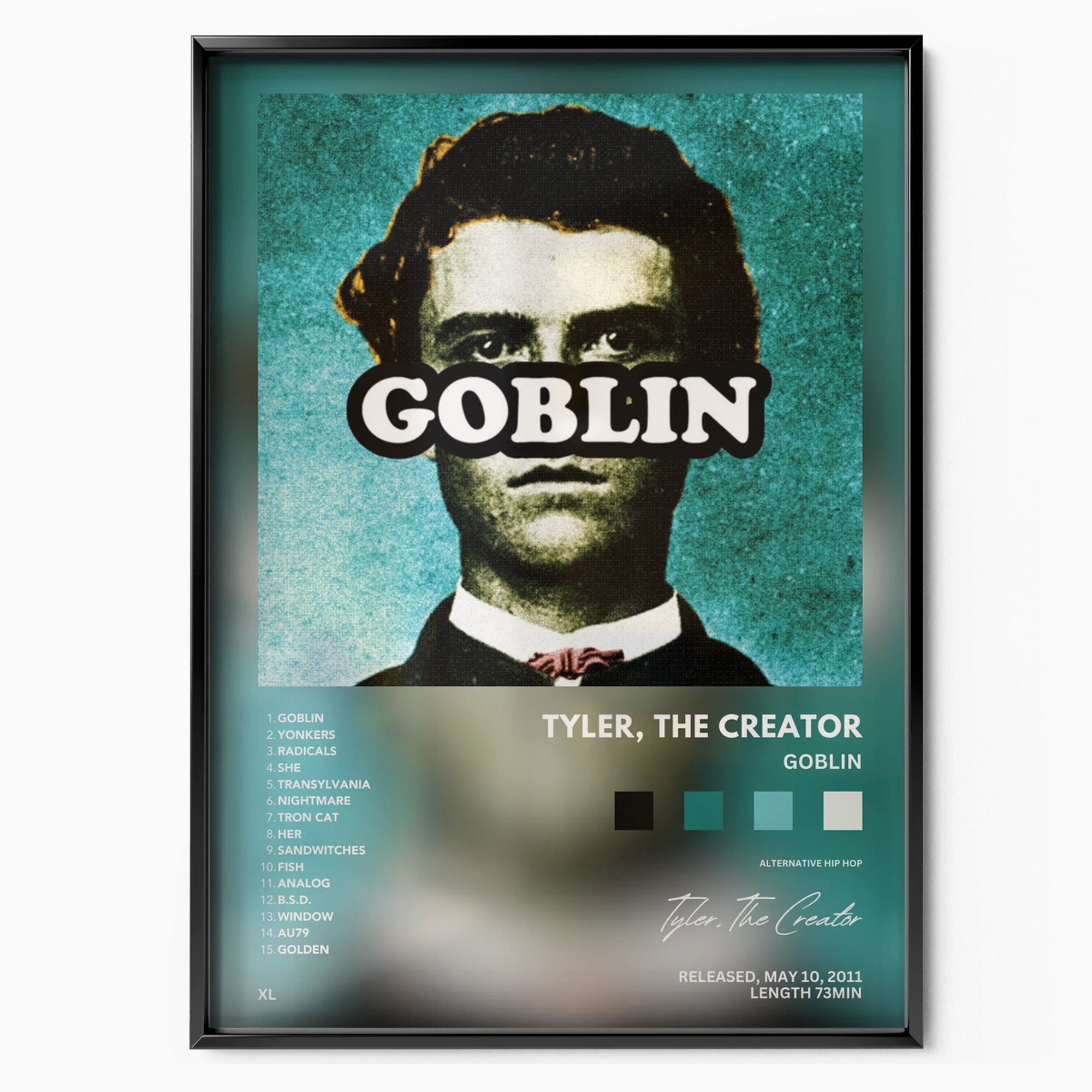
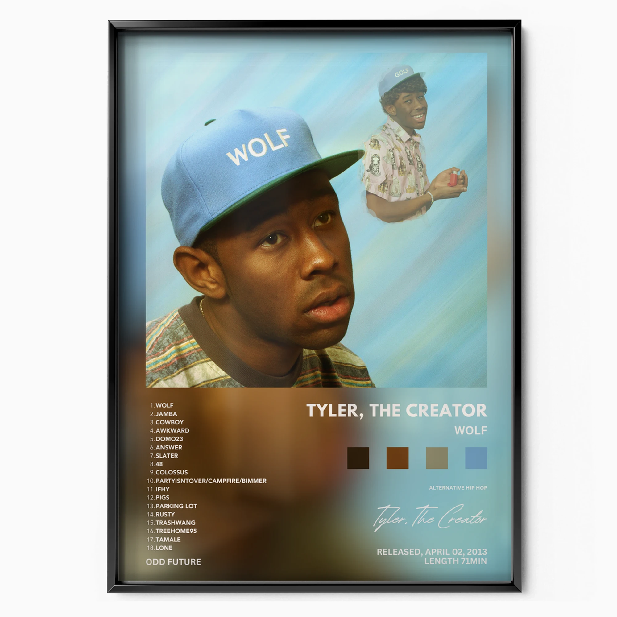
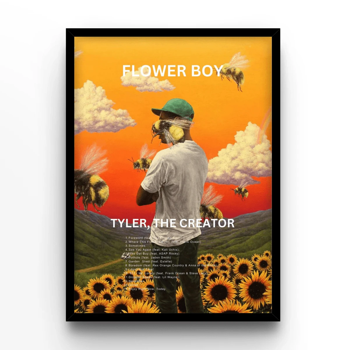
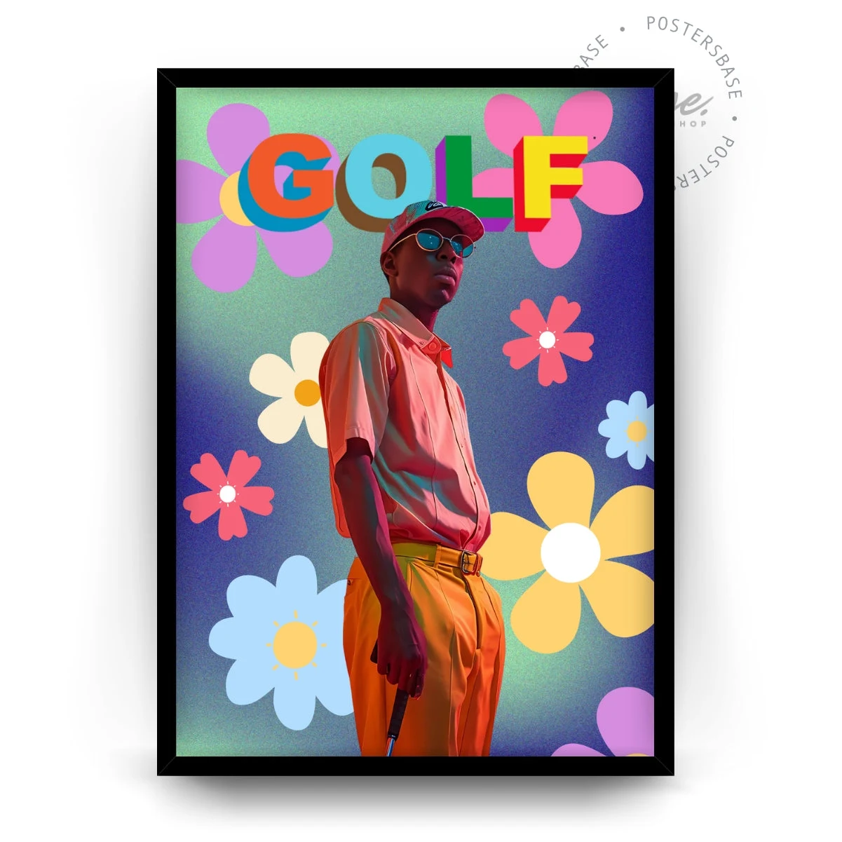
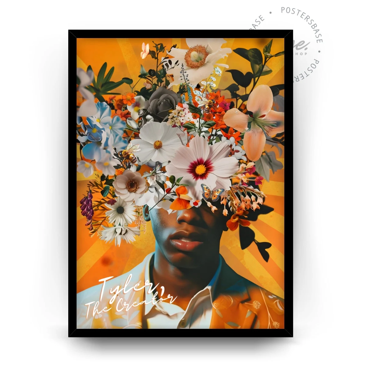
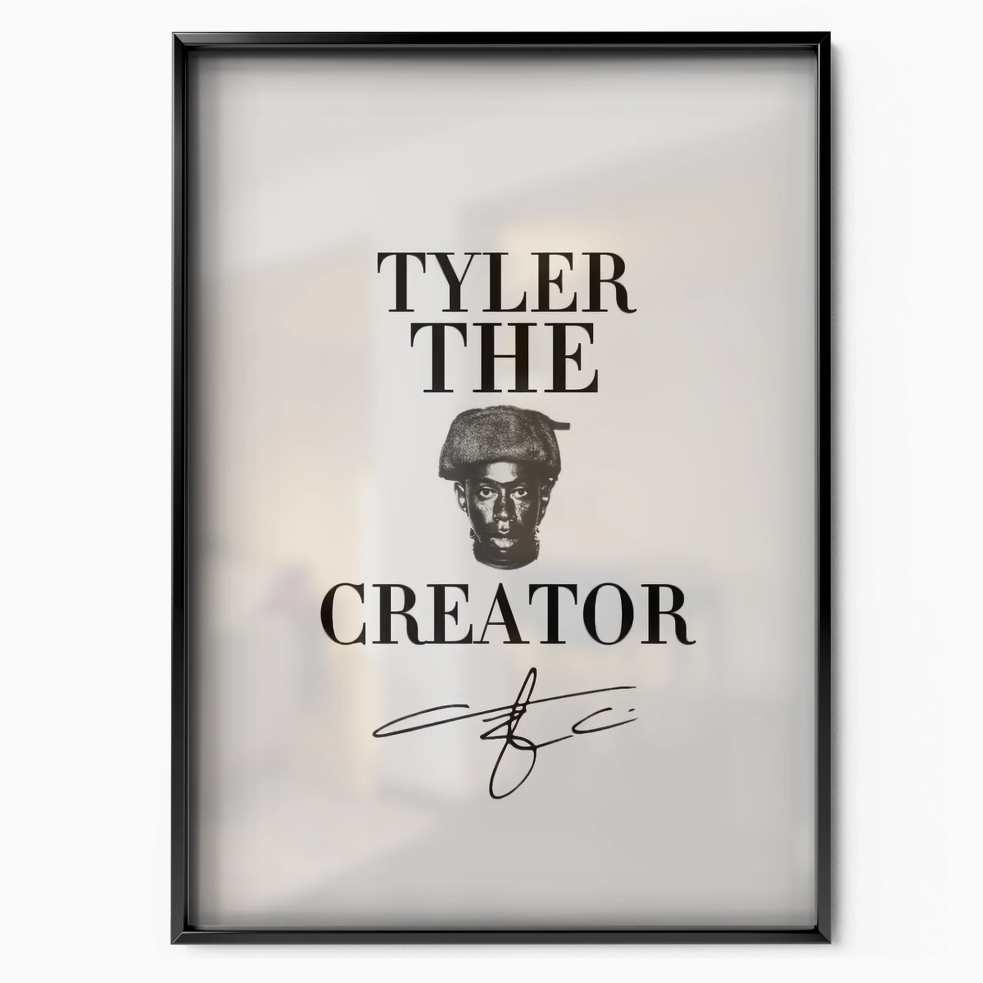
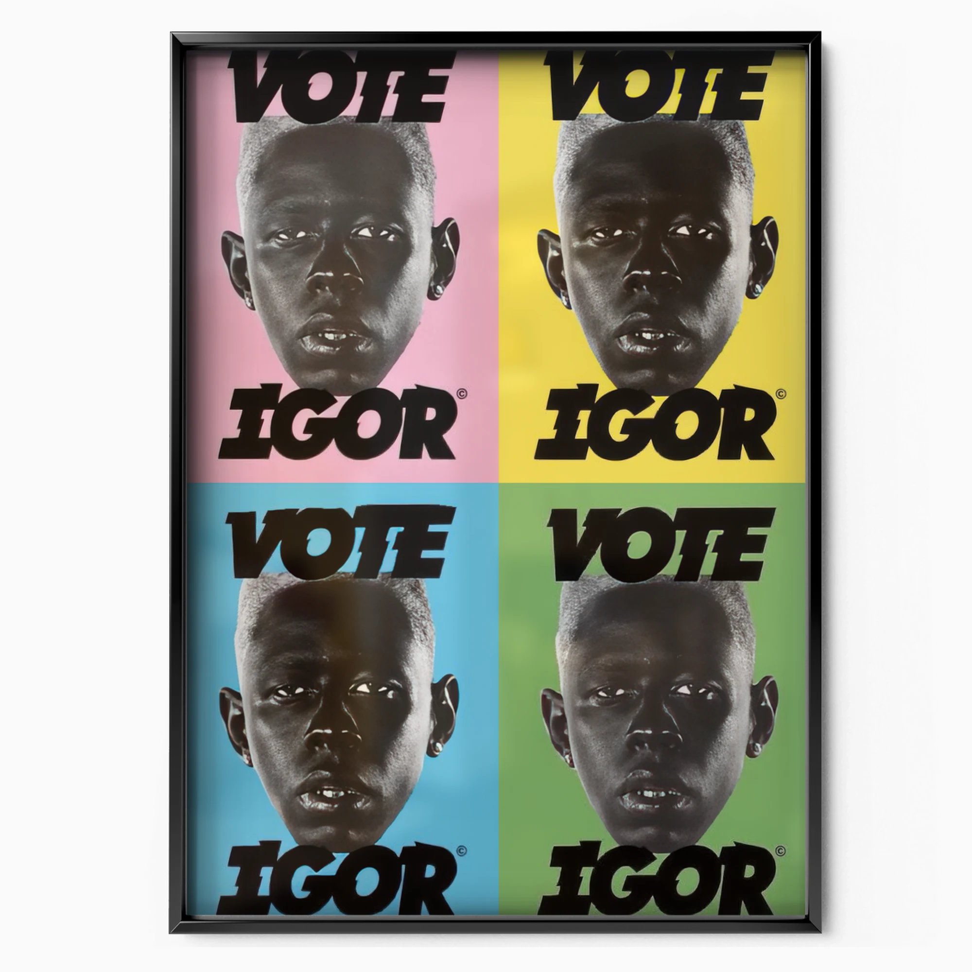
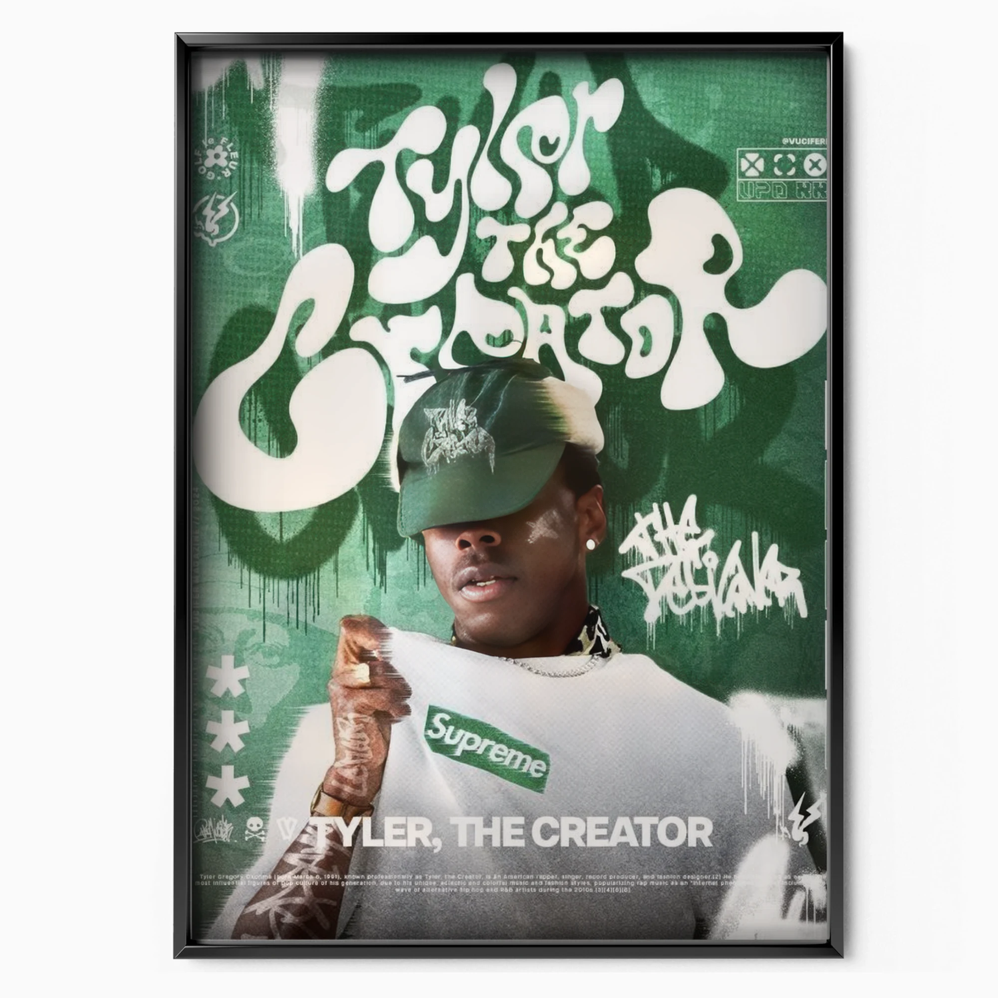
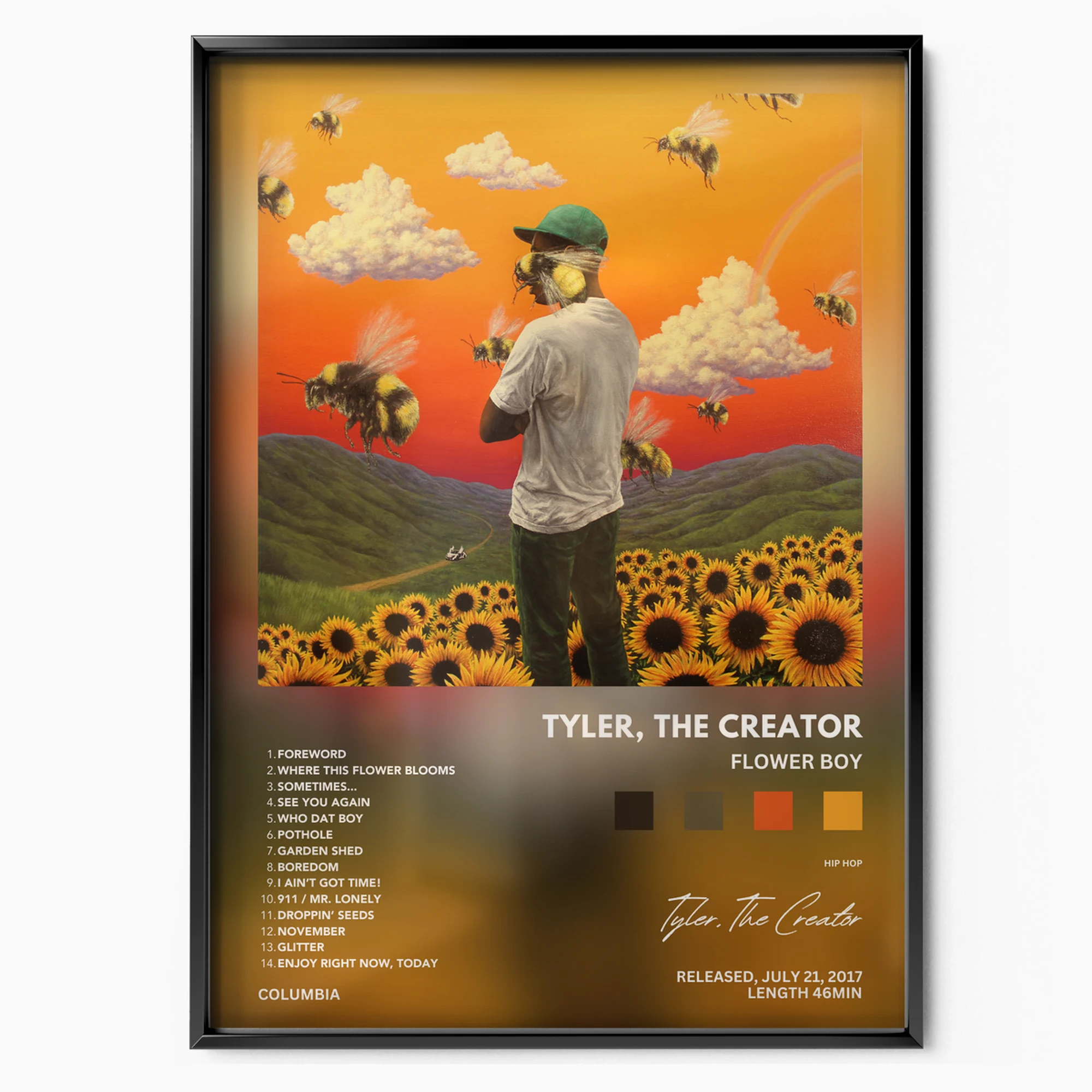
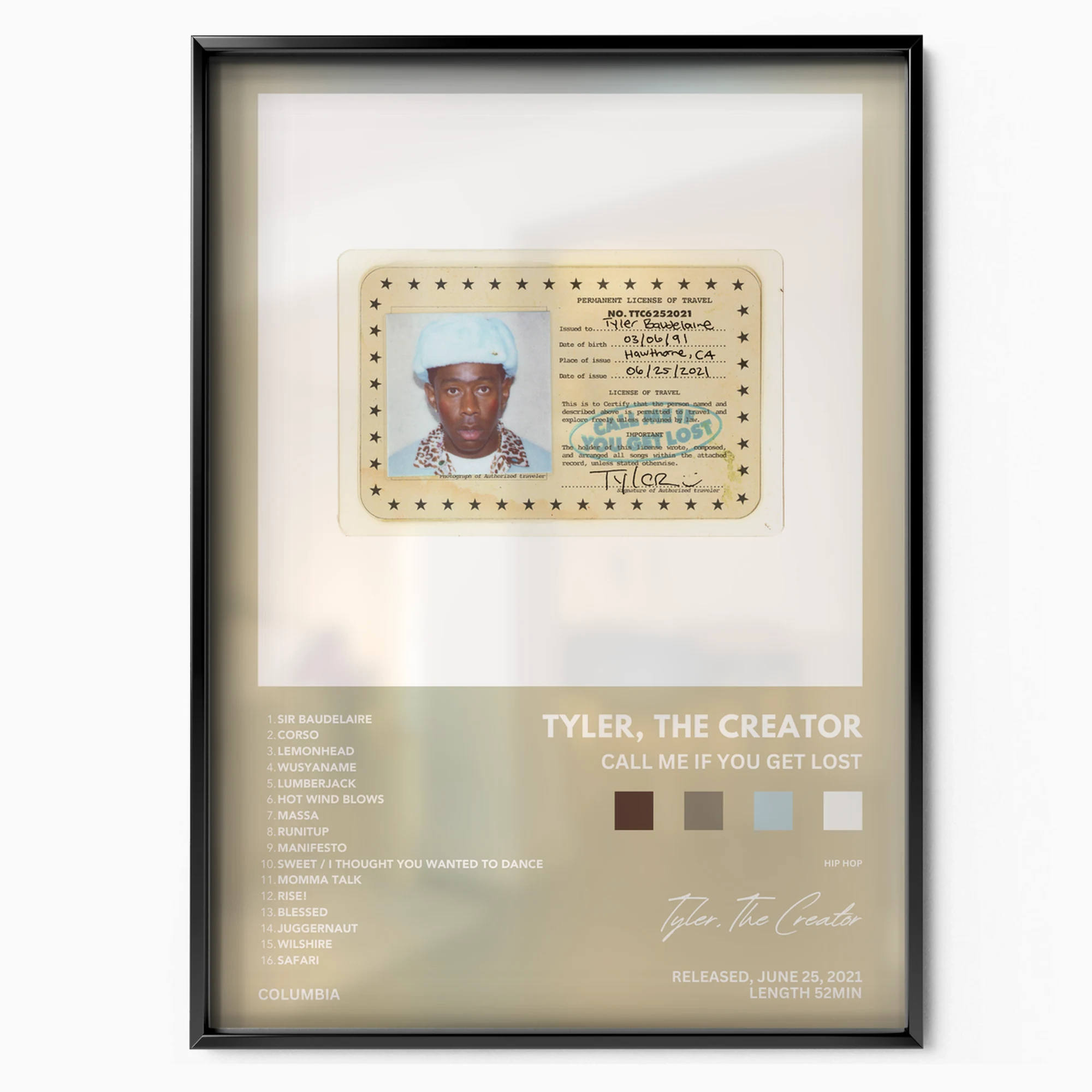
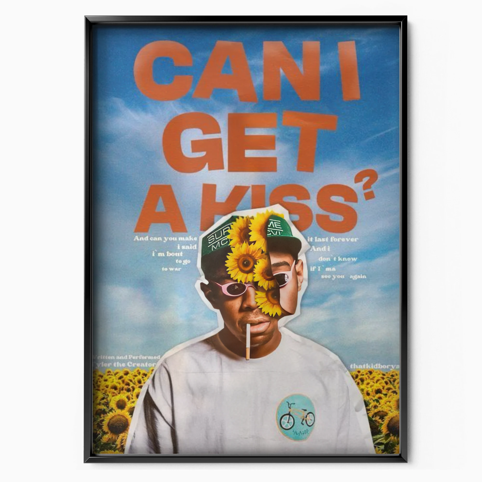
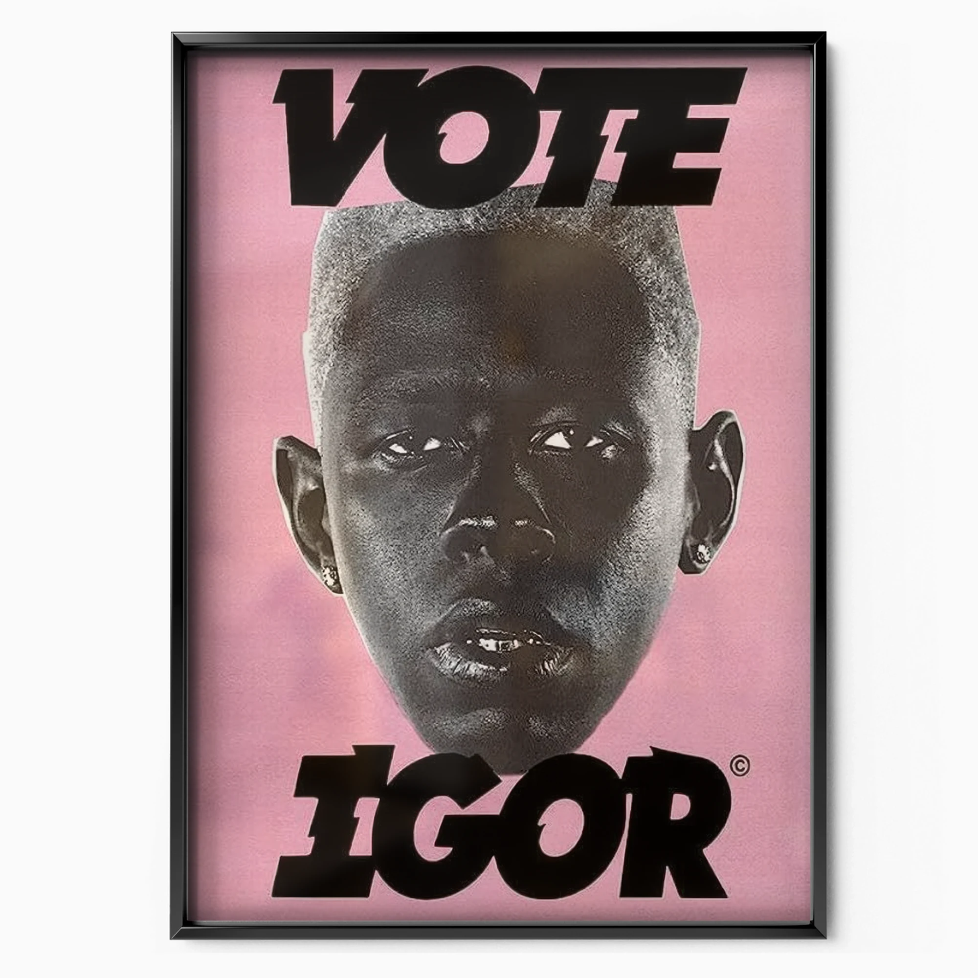
This is an artist whose fans pay attention to typography, colour grading and styling as much as the music, so the gift calculus is different here — the right pick is the era they quote, not the one that charted highest. A pastel Igor-era piece suits someone who loves the softer reinvention; an earlier, rawer cover fits a fan of the provocateur years. Because the palettes are so distinct, even two prints from different eras hung together make a deliberate statement about range, which is exactly how this fanbase likes to be understood. Framed side by side, the pastel calm against the earlier noise, they turn a single wall into a short course on an artist who refuses to repeat himself — and leave obvious space for whatever palette the next record brings. That is the kind of wall a fan keeps editing for years, which makes any single era a safe place to start — the pastel landmark for some, the raw early covers for others, with the rest of the sequence left to grow.